Тематические плавающие кнопки действий в Android с примером
Предпосылка:
- Плавающая кнопка действия (FAB) в Android с примером
- Расширенная плавающая кнопка действия в Android с примером
Разработчики приложений Android хотят привлечь внимание пользователей, настраивая и тематизируя виджеты приложений Android, и удерживать больше трафика клиентов только за счет дизайна приложения. В этой статье обсуждалось тематическое оформление одного из наиболее важных элементов пользовательского интерфейса - плавающих кнопок действий (как расширенных, так и обычных). Ниже приведены несколько примеров изображений плавающих кнопок действий.
Шаги по созданию тематических плавающих кнопок действий
Шаг 1. Создайте пустой проект Android Studio.
- Создайте проект студии Android Empty Activity. Вы можете обратиться к этому Как создать / запустить новый проект в Android Studio.
Шаг 2. Добавьте зависимость к файлу Gradle уровня приложения.
- Здесь мы используем плавающую кнопку действия, разработанную и разработанную командой Google Material Design.
- Добавьте зависимость в файл build.gradle (app) как:
implementation ‘com.google.android.material:material:1.3.0-alpha02’
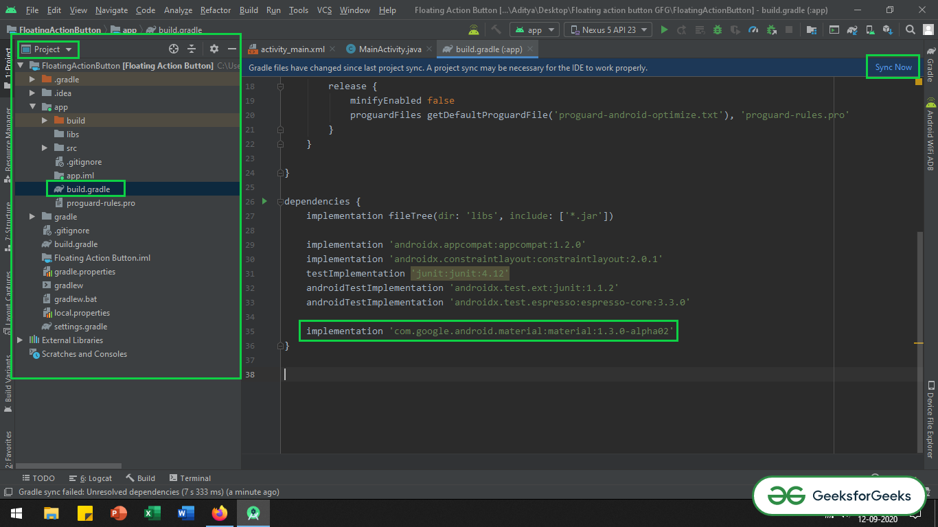
- Убедитесь, что вы добавили зависимость в файл Gradle уровня приложения. После добавления зависимости вам нужно нажать кнопку «Синхронизировать сейчас» , которая появляется в правом верхнем углу IDE Android Studio.
- Когда вы нажимаете кнопку «Синхронизировать сейчас», убедитесь, что вы подключены к сети, чтобы она могла загружать необходимые файлы.
- Обратитесь к изображению ниже, если вы не можете выполнить шаги, упомянутые выше, или если вы не можете найти файл Gradle уровня приложения:
Шаг 3. Измените базовую тему приложения в файле styles.xml.
- Тема должна быть изменена, поскольку кнопка действия ExtendedFloating является дочерним классом кнопок дизайна материалов Google. Поэтому ему необходимо применить тему MaterialComponent к базовой теме приложения. В противном случае приложение выйдет из строя сразу после того, как мы запустим приложение.
- Вы можете обратиться к этой статье: Кнопки дизайна материалов в Android с примером, поскольку кнопка дизайна ExtendedMaterial, является дочерним классом кнопок дизайна материала. В статье рассказывается о преимуществах использования кнопок материального дизайна и о том, почему необходимо изменить тему.
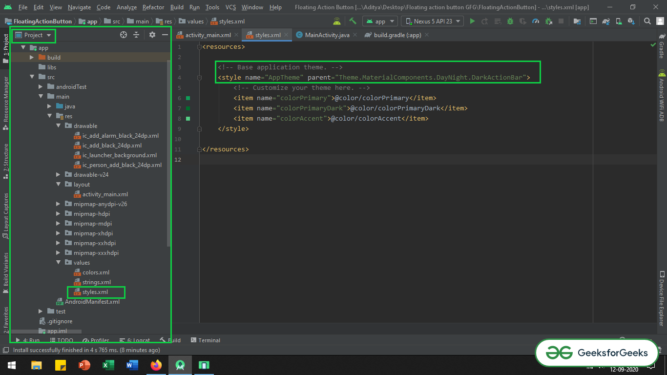
- Перейдите в app -> src -> main -> res -> values -> styles.xml и измените базовую тему приложения. MaterialComponents содержит различные стили темы панели действий, можно вызвать любой из стилей темы панели действий MaterialComponents , кроме стилей AppCompat. Ниже приведен код файла styles.xml.
XML
< resources > <!-- Base application theme. --> < style name = "AppTheme" parent = "Theme.MaterialComponents.DayNight.DarkActionBar" > <!-- Customize your theme here --> < item name = "colorPrimary" >@color/colorPrimary</ item > < item name = "colorPrimaryDark" >@color/colorPrimaryDark</ item > < item name = "colorAccent" >@color/colorAccent</ item > </ style ></ resources > |
Если вы не можете получить вещи на шаге, упомянутом выше, вы можете обратиться к этому изображению.
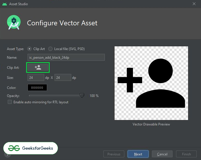
Шаг 4. Импортируйте некоторые векторные иконки в папку с возможностью переноса изображений.
- В этом случае для демонстрационных целей импортируются простые векторные иконки: добавить вектор, добавить сигнал тревоги, вектор, добавить человека.
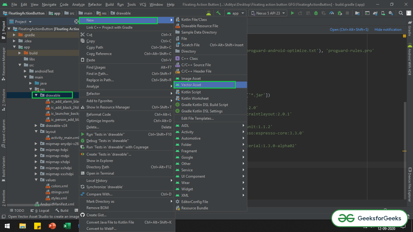
- Чтобы импортировать любой вектор в проект, нужно щелкнуть правой кнопкой мыши папку с возможностью рисования -> Создать -> Векторный объект.
- Откроется новое всплывающее окно, в котором можно выбрать любой вектор, который вы хотите, нажав кнопку « Картинки» .
- Вы можете обратиться к следующему изображению, чтобы узнать, как открыть селектор векторных ресурсов.
- Вы можете передать следующее изображение в том , как найти кнопку Clip Art и выбрать векторы.
Шаг 5: Работа с файлом activity_main.xml
- Теперь в файле activity_main.xml добавьте обычную плавающую кнопку действия и расширенную плавающую кнопку действия. Обязательно используйте ConstraintLayout.
- Вызовите обе кнопки плавающего действия, чтобы можно было увидеть, как эти обе кнопки изменяются после манипулирования файлом styles.xml.
- Вызовите следующий код, чтобы добавить обе плавающие кнопки действий:
XML
<? xml version = "1.0" encoding = "utf-8" ?>< androidx.constraintlayout.widget.ConstraintLayout android:layout_width = "match_parent" android:layout_height = "match_parent" tools:context = ".MainActivity" tools:ignore = "HardcodedText" > <!--Google material normal Floating Action Button--> <!--one needs to keep the margin of 16dp from the screen to button--> < com.google.android.material.floatingactionbutton.FloatingActionButton android:layout_width = "wrap_content" android:layout_height = "wrap_content" android:layout_marginStart = "16dp" android:layout_marginBottom = "16dp" android:src = "@drawable/ic_add_black_24dp" app:layout_constraintBottom_toBottomOf = "parent" app:layout_constraintStart_toStartOf = "parent" /> <!--Google material Extended Floating Action Button--> <!--one needs to keep the margin of 16dp from the screen to button--> < com.google.android.material.floatingactionbutton.ExtendedFloatingActionButton android:layout_width = "wrap_content" android:layout_height = "wrap_content" android:layout_marginEnd = "16dp" android:layout_marginBottom = "16dp" android:text = "Actions" app:icon = "@drawable/ic_add_black_24dp" app:layout_constraintBottom_toBottomOf = "parent" app:layout_constraintEnd_toEndOf = "parent" /> </ androidx.constraintlayout.widget.ConstraintLayout > |
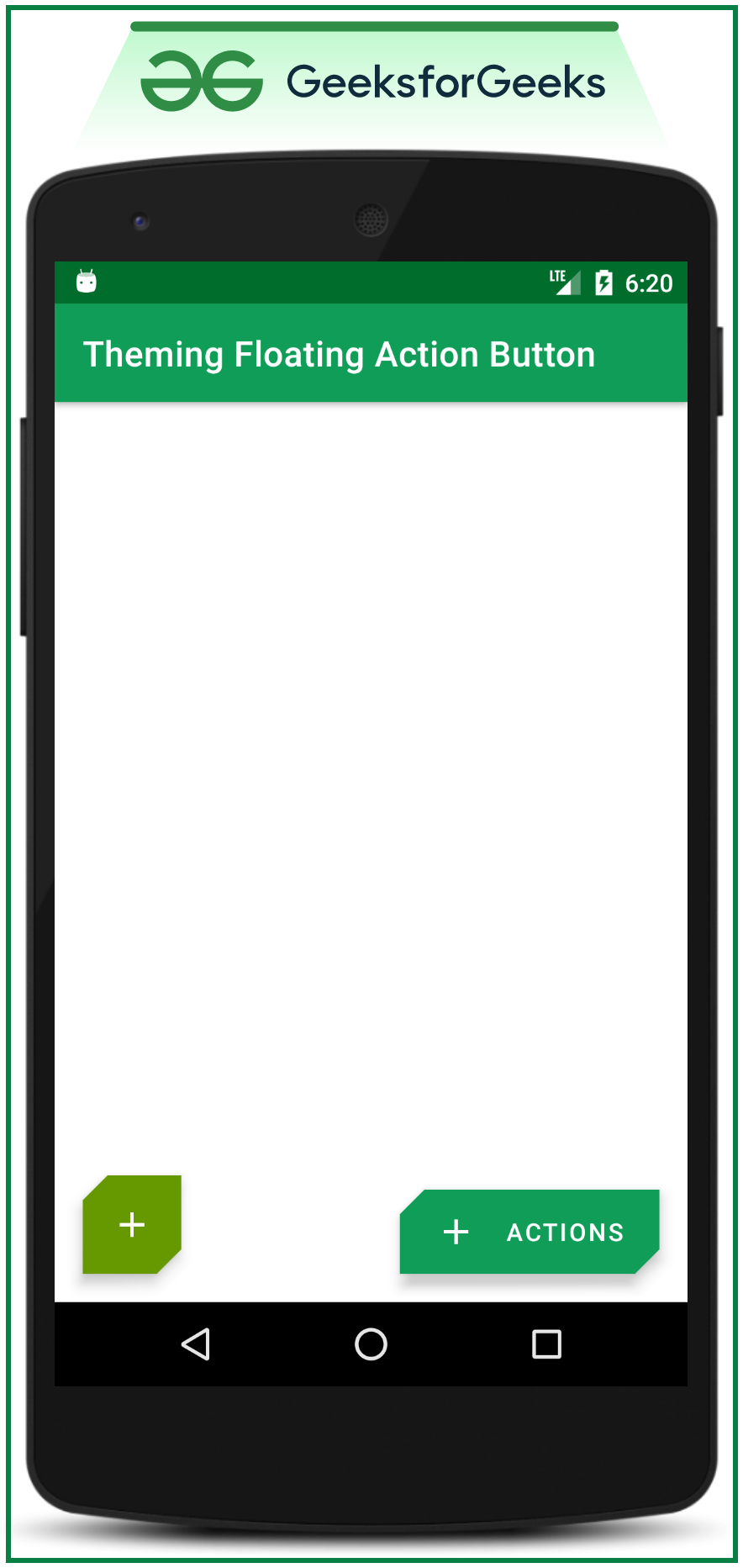
После вызова кода создается следующий пользовательский интерфейс:
- Чтобы изменить цвет фона обоих FAB, активируйте следующий атрибут при определении этих двух FAB в файле activity_main.xml (добавьте backgroundTint вручную, потому что все FAB будут применяться с темой SmallComponent по умолчанию).
android:backgroundTint=”@color/colorAccent”
Теперь давайте обсудим, как изменить тему обеих плавающих кнопок действий в одном коде:
- Чтобы изменить тему обоих FAB, нам нужно переопределить тему по умолчанию, которая является темой SmallComponent в файле styles.xml :
XML
< resources > <!-- Base application theme. --> < style name = "AppTheme" parent = "Theme.MaterialComponents.Light.DarkActionBar" > <!-- Customize your theme here. --> < item name = "colorPrimary" >@color/colorPrimary</ item > < item name = "colorPrimaryDark" >@color/colorPrimaryDark</ item > < item name = "colorAccent" >@color/colorAccent</ item > <!--to do the changes in the corner, the cornerFamily attribute is the part of the SmallComponent--> <!--so we need to override the shapeAppearanceSmallComponent--> <!--which is the default theme applied for all of the Google MDC buttons it may be FAB or MDC Buttons--> < item name = "shapeAppearanceSmallComponent" >@style/ShapeAppearance.App.SmallComponent</ item > </ style > < style name = "ShapeAppearance.App.SmallComponent" parent = "ShapeAppearance.MaterialComponents.SmallComponent" > < item name = "cornerFamily" >cut</ item > </ style > </ resources > |
Вывод: запустить в эмуляторе (после внесения изменений в styles.xml):
- Можно заметить, что в приведенном выше коде атрибут «cornerFamily» вызывается как значение « cut» . Итак, давайте переопределим семейство углов из темы SmallComponent.
- Атрибут « cornerFamily» содержит два значения: « вырезано» и « округлено». Для получения дополнительной информации об этом продолжайте читать статью о том, как изменить размер угла с помощью атрибута «cornerSize» .
- Таким образом, этот метод изменения темы влияет на все типы FAB, будь то расширенная или обычная FAB.
- Даже он меняет форму и тему кнопок дизайна материалов Google, если они реализованы в приложении. Пожалуйста, обратитесь к этому: Кнопки материального дизайна в Android с примером.
Теперь давайте обсудим, как отдельно изменить тему обоих типов FAB:
- Теперь в том же файле styles.xml нам нужно внести небольшие изменения.
- В предыдущем случае мы вызвали элемент shapeAppearanceSmallComponent внутри стиля AppTheme.
- Теперь нам нужно добавить элементы « extendedFloatingActionButtonStyle» для Extended FAB и « FloatingActionButtonStyle» для обычного FAB, чтобы различать тематику обоих.
- Обратитесь к следующему коду, чтобы узнать, как это было сделано:
XML
< resources > <!-- Base application theme. --> < style name = "AppTheme" parent = "Theme.MaterialComponents.Light.DarkActionBar" > <!-- Customize your theme here. --> < item name = "colorPrimary" >@color/colorPrimary</ item > < item name = "colorPrimaryDark" >@color/colorPrimaryDark</ item > < item name = "colorAccent" >@color/colorAccent</ item > <!--this attribute is to change the theme of the extended FAB--> < item name = "extendedFloatingActionButtonStyle" > @style/Widget.App.ExtendedFloatingActionButton</ item > <!--this attribute is to change the theme of the normal FAB--> < item name = "floatingActionButtonStyle" >@style/Widget.App.FloatingActionButton</ item > </ style > <!--changing the theme of the base application ends here--> <!--Now changing theme of extended FAB begins from here--> <!--make sure to change the value of the parent as Widget.MaterialComponents.ExtendedFloatingActionButton--> <!--as we are only changing the theme of the extended FAB--> <!--inside Widget.App.ExtendedFloatingActionButton there are two attribute--> <!--which are making the change of the theme of the extended FAB--> <!--those are materialThemeOverlay and shapeAppearanceOverlay--> < style name = "Widget.App.ExtendedFloatingActionButton" parent = "Widget.MaterialComponents.ExtendedFloatingActionButton" > <!--the following attribute will changes in the appearance of the extended FAB in terms of colors--> < item name = "materialThemeOverlay" >@style/myCustomThemeForExtendedFab</ item > <!--the following attribute will change in the shape appearance of the extended FAB--> < item name = "shapeAppearanceOverlay" >@style/customExtendedFAB</ item > <!--to make the code look cleaner and readable, the above two children are implemented separately--> </ style > <!--this style is the child of the shapeAppearanceOverlay attribute which in turn is the child of materialThemeOverlay--> < style name = "customExtendedFAB" > <!--for the extended FAB the cornerFamily is given the value as the cut--> < item name = "cornerFamily" >cut</ item > <!--and the cornerSize makes the cut for all 4 corners of the FAB as 10dp--> < item name = "cornerSize" >10dp</ item > </ style > <!--Here no need of mentioning the parent--> <!--because this is already the child of the shapeAppearanceOverlay which in turn is the child--> <!--of the Widget.App.ExtendedFloatingActionButton--> < style name = "myCustomThemeForExtendedFab" parent = "" > <!--this attribute gives makes the change in the background of the FAB--> < item name = "colorSecondary" >@color/colorPrimary</ item > <!--this attribute gives makes the change in the text and icon color of the FAB--> < item name = "colorOnSecondary" >@android:color/white</ item > </ style > <!--Changing the theme of the extended FAB completes here--> <!--Now changing theme of normal FAB begins from here--> <!--make sure to change the value of the parent as Widget.MaterialComponents.FloatingActionButton--> <!--as we are only changing the theme of the normal FAB--> <!--inside Widget.App.FloatingActionButton there are two attribute--> <!--which are making the change of the theme of the normal FAB--> <!--those are materialThemeOverlay and shapeAppearanceOverlay--> < style name = "Widget.App.FloatingActionButton" parent = "Widget.MaterialComponents.FloatingActionButton" > <!--the following attribute will changes in the appearance of the normal FAB in terms of colors--> < item name = "materialThemeOverlay" >@style/myCustomThemeForNormalFab</ item > <!--the following attribute will change in the shape appearance of the normal FAB--> < item name = "shapeAppearanceOverlay" >@style/customNormalFAB</ item > <!--to make the code look cleaner and readable, the above two children are implemented separately--> </ style > < style name = "customNormalFAB" > <!--for the normal FAB the cornerFamily is given the value as the rounded--> <!--in this case it has been done to differentiate the themes of the normal FAB and extended FAB--> < item name = "cornerFamily" >rounded</ item > <!--and the cornerSize makes rounded corner for all 4 corners of the FAB as 20dp radius--> < item name = "cornerSize" >20dp</ item > </ style > < style name = "myCustomThemeForNormalFab" parent = "" > <!--for the extended FAB the cornerFamily is given the value as the cut--> < item name = "colorSecondary" >@android:color/holo_green_dark</ item > <!--this attribute gives makes the change in the text and icon color of the FAB--> < item name = "colorOnSecondary" >@android:color/white</ item > </ style > <!--Changing the theme of the normal FAB completes here--> </ resources > |
После внесения изменений в файл styles.xml создается следующий пользовательский интерфейс:
- Теперь разные темы устанавливаются отдельно для обычного FAB и расширенного FAB.
Note: The colors of both FABs are made different in this case, for demonstration purpose only, as this is not recommended the colors of the all FABs must be same for entire application according to material design recommendations.
Поэкспериментируйте с customNormalFAB и customExtendedFAB
- Теперь поэкспериментируйте с дочерними элементами «customNormalFAB» и « customExtendedFAB » (а остальные вещи остаются неизменными), чтобы внести изменения в формы обоих FAB.
- Также поэкспериментируйте с « cornerSizeTopRight», «cornerSizeTopLeft», «cornerSizeBottomRight» и « cornerSizeBottomLeft».
- Теперь внесите следующие изменения в обоих дочерних элементов:
Пример 1:
XML
<!--for Extended FAB-->< style name = "customExtendedFAB" > <!--for the extended FAB the cornerFamily is given the value as the cut--> < item name = "cornerFamily" >cut</ item > <!--this attribute will make changes to Top Right according to value--> < item name = "cornerSizeTopRight" >0dp</ item > <!--this attribute will make changes to Top Left according to value--> < item name = "cornerSizeTopLeft" >0dp</ item > <!--this attribute will make changes to Bottom Right according to value--> < item name = "cornerSizeBottomRight" >0dp</ item > <!--this attribute will make changes to Bottom Left according to value--> < item name = "cornerSizeBottomLeft" >0dp</ item > </ style > <!--for Normal FAB-->< style name = "customNormalFAB" > <!--for the extended FAB the cornerFamily is given the value as the cut--> < item name = "cornerFamily" >cut</ item > <!--this attribute will make changes to Top Right according to value--> < item name = "cornerSizeTopRight" >0dp</ item > <!--this attribute will make changes to Top Left according to value--> < item name = "cornerSizeTopLeft" >0dp</ item > <!--this attribute will make changes to Bottom Right according to value--> < item name = "cornerSizeBottomRight" >0dp</ item > <!--this attribute will make changes to Bottom Left according to value--> < item name = "cornerSizeBottomLeft" >0dp</ item > </ style > |
Выходной интерфейс будет:
Пример 2:
XML
<!--for Extended FAB-->< style name = "customExtendedFAB" > <!--for the extended FAB the cornerFamily is given the value as the cut--> < item name = "cornerFamily" >cut</ item > <!--this attribute will make changes to Top Right according to value--> < item name = "cornerSizeTopRight" >0dp</ item > <!--this attribute will make changes to Top Left according to value--> < item name = "cornerSizeTopLeft" >14dp</ item > <!--this attribute will make changes to Bottom Right according to value--> < item name = "cornerSizeBottomRight" >14dp</ item > <!--this attribute will make changes to Bottom Left according to value--> < item name = "cornerSizeBottomLeft" >0dp</ item > </ style > <!--for Normal FAB-->< style name = "customNormalFAB" > <!--for the extended FAB the cornerFamily is given the value as the cut--> < item name = "cornerFamily" >cut</ item > <!--this attribute will make changes to Top Right according to value--> < item name = "cornerSizeTopRight" >0dp</ item > <!--this attribute will make changes to Top Left according to value--> < item name = "cornerSizeTopLeft" >14dp</ item > <!--this attribute will make changes to Bottom Right according to value--> < item name = "cornerSizeBottomRight" >14dp</ item > <!--this attribute will make changes to Bottom Left according to value--> < item name =
|