Кнопки тематического дизайна материалов в Android с примерами
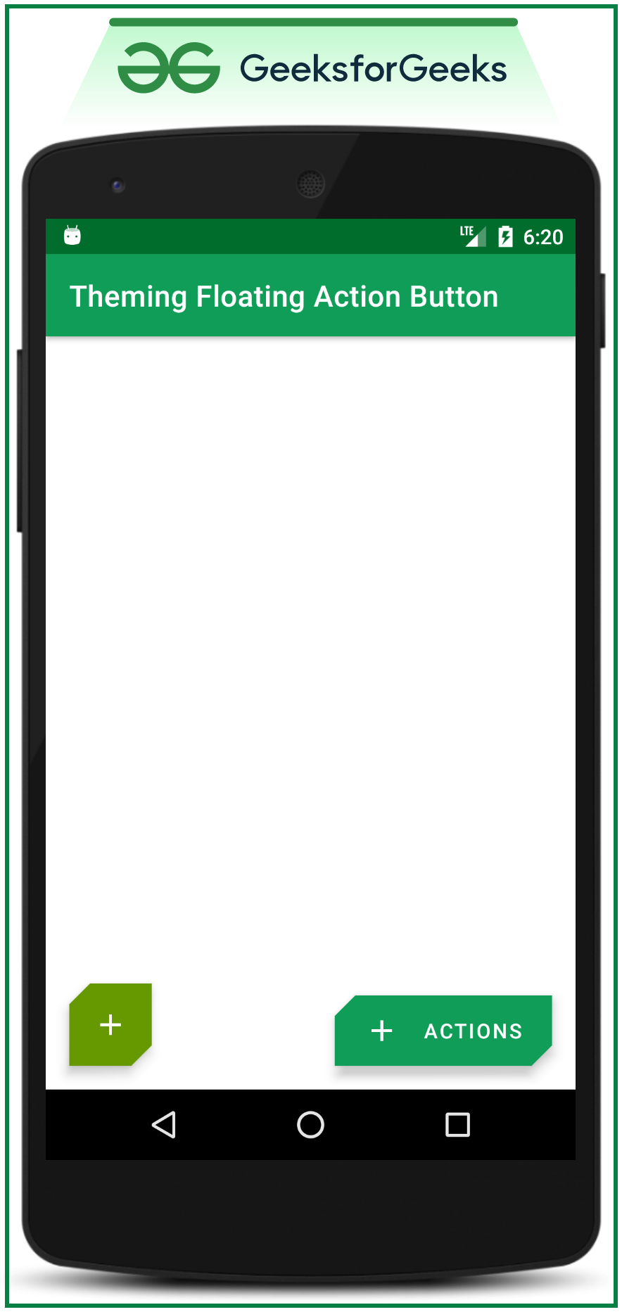
Компоненты материального дизайна (MDC Android) предлагают дизайнерам и разработчикам способ реализовать материальный дизайн в своих приложениях для Android. Эти компоненты, разработанные основной командой инженеров и дизайнеров пользовательского интерфейса Google, обеспечивают надежный рабочий процесс разработки для создания красивых и функциональных приложений для Android. Если вам нравится, насколько хороши элементы пользовательского интерфейса из компонентов дизайна материалов Google для Android, разработанные Google, то вот несколько шагов, которые необходимо выполнить, чтобы их получить, и один из них - компоненты дизайна материалов Google (MDC ) Кнопки . Кнопка - это пользовательский интерфейс, который используется для выполнения определенных действий при нажатии или нажатии. В предыдущей статье « Кнопки материального дизайна в Android с примером» мы обсудили четыре типа кнопок: содержащаяся кнопка, выделенная кнопка, текстовая кнопка и кнопка переключения . Итак, в этой статье мы собираемся обсудить еще один популярный тип кнопок, то есть кнопки Theming Material Design . В конце этой статьи можно легко добавить значки к кнопкам материального дизайна и изменить или переопределить тему по умолчанию для кнопок материального дизайна. Ниже приводится образец изображения, чтобы понять, какие типы кнопок мы собираемся создать в этой статье.
Шаг по созданию кнопок тематического дизайна материалов
Шаг 1. Создайте новый проект
Чтобы создать новый проект в Android Studio, обратитесь к разделу «Как создать / запустить новый проект в Android Studio».
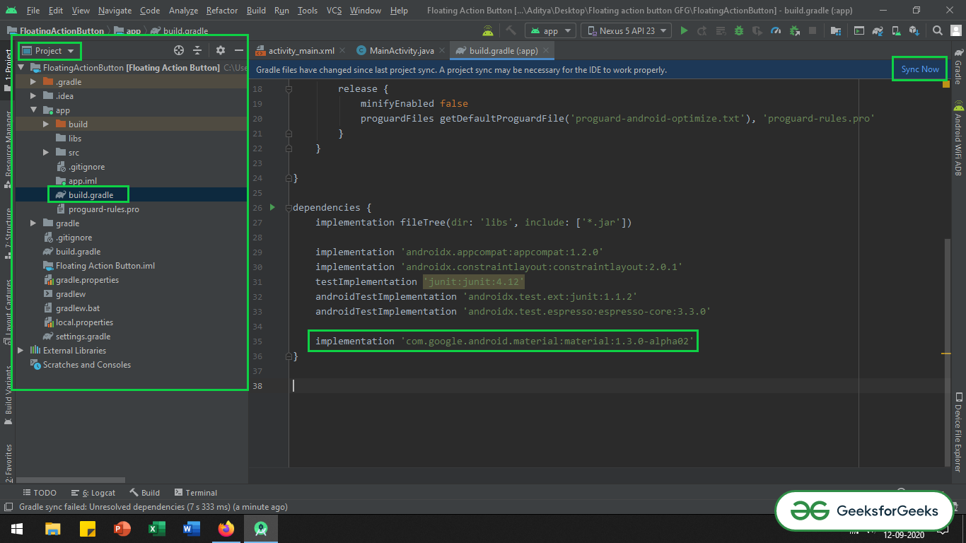
Шаг 2. Добавьте зависимость дизайна материала в файл Gradle на уровне приложения.
Вызовите следующую строку кода в поле зависимостей.
implementation ‘com.google.android.material:material:1.3.0-alpha02’
Если не удается найти файл Gradle уровня приложения, обратитесь к следующему изображению, чтобы получить его в представлении «Проект».
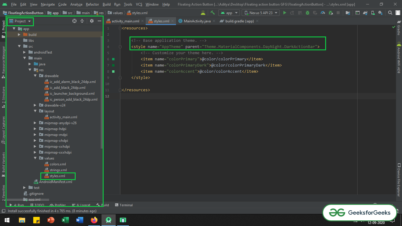
Шаг 3. Измените базовую тему приложения
Перейдите в app> src> main> res> values> styles.xml и измените базовую тему приложения. MaterialComponents содержит различные стили темы панели действий, можно вызвать любой из стилей темы панели действий MaterialComponents , кроме стилей AppCompat. Ниже приведен код файла styles.xml.
XML
< resources > <!-- Base application theme. --> < style name = "AppTheme" parent = "Theme.MaterialComponents.Light.DarkActionBar" > <!-- Customize your theme here. --> < item name = "colorPrimary" >@color/colorPrimary</ item > < item name = "colorPrimaryDark" >@color/colorPrimaryDark</ item > < item name = "colorAccent" >@color/colorAccent</ item > </ style > </ resources > |
Если не удается найти файл styles.xml, обратитесь к следующему изображению.
Шаг 4. Работа с activity_main.xml
В этом случае активируются типичные 3 кнопки материального дизайна. Это содержащаяся кнопка, кнопка с контуром, кнопка с текстом. Чтобы узнать, как их использовать и как их вызывать, можно прочитать в статье «Кнопки дизайна материалов в Android с примерами». Вызовите следующий код в файле activity_main.xml, чтобы реализовать все типы кнопок материального дизайна. Комментарии добавляются внутри кода для более подробного понимания кода.
XML
<? xml version = "1.0" encoding = "utf-8" ?>< LinearLayout android:layout_width = "match_parent" android:layout_height = "match_parent" android:orientation = "vertical" tools:context = ".MainActivity" tools:ignore = "HardcodedText" > <!--Contained Button--> <!--there is no style attribute for contained button--> <!--by default the button itself is a contained button--> < Button android:layout_width = "wrap_content" android:layout_height = "wrap_content" android:layout_gravity = "center" android:layout_marginTop = "64dp" android:text = "Contained Button" /> <!--Outlined Button--> <!--need to carefully invoke the style attribute--> < Button style = "@style/Widget.MaterialComponents.Button.OutlinedButton.Icon" android:layout_width = "wrap_content" android:layout_height = "wrap_content" android:layout_gravity = "center" android:layout_marginTop = "64dp" android:text = "Outlined Button" /> <!--Text Button--> <!--need to carefully invoke the style attribute--> < Button style = "@style/Widget.MaterialComponents.Button.TextButton.Icon" android:layout_width = "wrap_content" android:layout_height = "wrap_content" android:layout_gravity = "center" android:layout_marginTop = "64dp" android:text = "Text Button" /> </ LinearLayout > |
Выход: запустить на эмуляторе
Шаги по добавлению значков к кнопкам материального дизайна
Шаг 1. Импортируйте векторные иконки в папку с возможностью переноса изображений.
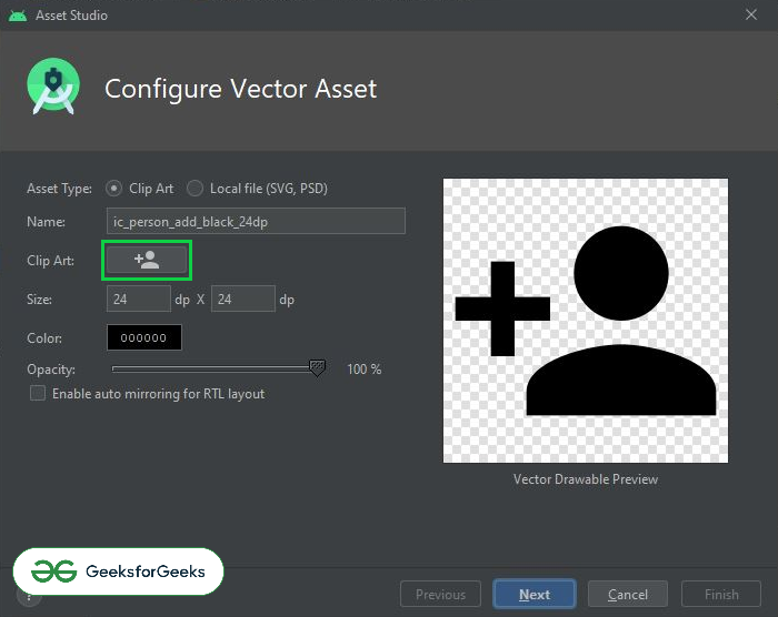
Чтобы импортировать векторные значки в папку с возможностью рисования, щелкните правой кнопкой мыши папку с возможностью рисования> перейдите к «Создать»> щелкните элемент Vector Asset. Теперь выберите желаемый вектор во всплывающем окне. Можно обратиться к следующему изображению, чтобы получить всплывающее окно выбора векторных значков.
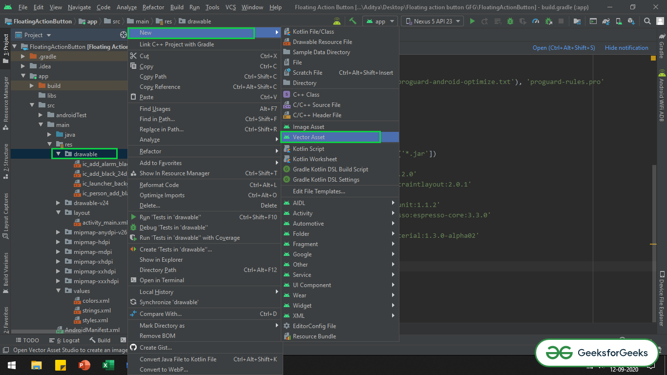
Нажмите отмеченную кнопку на изображении ниже, чтобы выбрать нужные векторные иконки.
Шаг 2. Работа с файлом activity_main.xml
Добавив атрибут app: icon в каждую из кнопок и выбрав нужный векторный значок из папки с возможностью рисования, вы добавите значок к кнопкам материального дизайна. Итак, вызовите следующий код.
XML
<? xml version = "1.0" encoding = "utf-8" ?> <!--there is need to invoke the app namespace to add icons to material design button-->< LinearLayout android:layout_width = "match_parent" android:layout_height = "match_parent" android:orientation = "vertical" tools:context = ".MainActivity" tools:ignore = "HardcodedText" > <!--Contained Button--> <!--there is no style attribute for contained button--> <!--by default the button itself is a contained button--> < Button android:layout_width = "wrap_content" android:layout_height = "wrap_content" android:layout_gravity = "center" android:layout_marginTop = "64dp" android:text = "Contained Button" app:icon = "@drawable/ic_add_black_24dp" /> <!--Outlined Button--> <!--need to carefully invoke the style attribute--> < Button style = "@style/Widget.MaterialComponents.Button.OutlinedButton" android:layout_width = "wrap_content" android:layout_height = "wrap_content" android:layout_gravity = "center" android:layout_marginTop = "64dp" android:text = "Outlined Button" app:icon = "@drawable/ic_add_black_24dp" /> <!--Text Button--> <!--need to carefully invoke the style attribute--> < Button style = "@style/Widget.MaterialComponents.Button.TextButton.Icon" android:layout_width = "wrap_content" android:layout_height = "wrap_content" android:layout_gravity = "center" android:layout_marginTop = "64dp" android:text = "Text Button" app:icon = "@drawable/ic_add_black_24dp" /> </ LinearLayout > |
Выход: запустить на эмуляторе
Есть два метода переопределения темы кнопок материального дизайна:
Здесь значки необязательны. Итак, в этом случае значок был удален. Однако тему можно переопределить со значком или без него.
Способ 1:
Этот метод реализации повлияет на другие компоненты материала, а также кнопки материального дизайна. Вызовите следующий код в файле styles.xml, чтобы переопределить тему по умолчанию для кнопок материального дизайна.
XML
< resources > <!-- Base application theme. --> < style name = "AppTheme" parent = "Theme.MaterialComponents.Light.DarkActionBar" > <!-- Customize your theme here. --> < item name = "colorPrimary" >@color/colorPrimary</ item > < item name = "colorPrimaryDark" >@color/colorPrimaryDark</ item > < item name = "colorAccent" >@color/colorAccent</ item > <!--this item is to override the fontFamily of the material design buttons--> < item name = "textAppearanceButton" >@style/TextAppearance.App.Button</ item > <!--this item is to override the cornerFamily and cornerSize of the material design buttons--> < item name = "shapeAppearanceSmallComponent" >@style/ShapeAppearance.App.SmallComponent</ item > </ style > <!--This overrides the fontFamily and textSize of material design buttons--> < style name = "TextAppearance.App.Button" parent = "TextAppearance.MaterialComponents.Button" > < item name = "fontFamily" >sans-serif-black</ item > < item name = "android:fontFamily" >sans-serif</ item > < item name = "android:textSize" >18sp</ item > </ style > <!--This overrides the cornerFamily and cornerSize of the default material design button--> < style name = "ShapeAppearance.App.SmallComponent" parent = "ShapeAppearance.MaterialComponents.SmallComponent" > < item name = "cornerFamily" >cut</ item > < item name = "cornerSize" >8dp</ item > </ style > </ resources > |
Выход: запустить на эмуляторе
Можно заметить изменение углового среза на 8dp , аналогичное у всех кнопок.
Note: By using this method if the application contains the material design floating action button, the default theme of those all floating action button overriden by same attributes invoke in above code.
Способ 2:
Этот метод переопределения темы по умолчанию для кнопки материального дизайна повлияет на каждую из отдельных кнопок. В этом случае различные атрибуты могут быть переопределены для содержащейся кнопки, выделенной кнопки и текстовой кнопки. Вызовите следующий код в файле styles.xml .
XML
< resources > <!-- Base application theme. --> < style name = "AppTheme" parent = "Theme.MaterialComponents.Light.DarkActionBar" > <!-- Customize your theme here. --> < item name = "colorPrimary" >@color/colorPrimary</ item > < item name = "colorPrimaryDark" >@color/colorPrimaryDark</ item > < item name = "colorAccent" >@color/colorAccent</ item > <!--this item is invoked in app theme to override the contained material button--> < item name = "materialButtonStyle" >@style/myCustomContainedButton</ item > <!--this item is invoked in app theme to override the outlined material button--> < item name = "materialButtonOutlinedStyle" >@style/myCustomOutlinedButton</ item > </ style > <!--Base application theme ends here--> <!--theming of contained button begins here--> <!--parent name is to be give carefully--> < style name = "myCustomContainedButton" parent = "Widget.MaterialComponents.Button" > <!--these all styles are implemented outside, because to get all the overridden attributes easily--> < item name = "shapeAppearance" >@style/customContainedButtonTheme</ item > < item name = "android:textAppearance" >@style/myCustomTextForMaterialButtons</ item > </ style > <!--overriding cornerSize and cornerFamily of the contained button--> < style name = "customContainedButtonTheme" > < item name = "cornerFamily" >rounded</ item > < item name = "cornerSize" >24dp</ item > </ style > <!--theming of contained button ends here--> <!--theming of outlined button begins here--> <!--parent name is to be give carefully--> < style name = "myCustomOutlinedButton" parent = "Widget.MaterialComponents.Button.OutlinedButton" > <!--these all styles are implemented outside, because to get all the overridden attributes easily--> < item name = "shapeAppearance" >@style/customOutlinedButtonTheme</ item > < item name = "android:textAppearance" >@style/myCustomTextForMaterialButtons</ item > </ style > <!--overriding cornerSize and cornerFamily of the outlined button--> < style name = "customOutlinedButtonTheme" > < item name = "cornerFamily" >cut</ item > < item name = "cornerSize" >12dp</ item > </ style > <!--theming of outlined button ends here--> <!--Font family and size of all the buttons in the entire application should be same--> <!--so this child is common for all the material buttons in entire application--> < style name = "myCustomTextForMaterialButtons" > < item name = "fontFamily" >sans-serif-condensed-medium</ item > < item name = "android:textSize" >18sp</ item > < item name = "android:fontFamily" >sans-serif</ item > </ style > </ resources > |
Обратите внимание, что здесь тема по умолчанию для текстовой кнопки не переопределяется, потому что это не сильно влияет, поскольку у нее нет рамки и цвета фона. В самом файле activity_main.xml можно изменить только цвет текста и шрифт текста. После переопределения темы по умолчанию для всех кнопок необходимо изменить атрибут стиля кнопки структуры в файле activity_main.xml. Это необходимо изменить, потому что выделенная кнопка является дочерним классом кнопки материала. Если она не активирована, выделенная кнопка будет наследовать стиль содержащейся кнопки.
XML
<? xml version = "1.0" encoding = "utf-8" ?>< LinearLayout android:layout_width = "match_parent" android:layout_height = "match_parent" android:orientation = "vertical" tools:context = ".MainActivity" tools:ignore = "HardcodedText" > <!--Contained Button--> <!--there is no style attribute for contained button--> <!--by default the button itself is a contained button--> < Button android:layout_width = "wrap_content" android:layout_height = "wrap_content" android:layout_gravity = "center" android:layout_marginTop = "64dp" android:text = "Contained Button" /> <!--Outlined Button--> <!--need to carefully invoke the style attribute--> < Button style = "@style/myCustomOutlinedButton" android:layout_width = "wrap_content" android:layout_height = "wrap_content" android:layout_gravity = "center" android:layout_marginTop = "64dp" android:text = "Outlined Button" /> <!--Text Button--> <!--need to carefully invoke the style attribute--> < Button style = "@style/Widget.MaterialComponents.Button.TextButton.Icon" android:layout_width = "wrap_content" android:layout_height = "wrap_content" android:layout_gravity = "center" android:layout_marginTop = "64dp" android:text = "Text Button" /> </ LinearLayout > |
Выход: запустить на эмуляторе