Как создать расширяемый CardView в Android
Расширяемый Cardview позволяет создавать панели расширения без особых хлопот и без написания стандартного кода. Расширяемый просмотр карточек становится весьма полезным, когда дело доходит до эффективного и систематического представления данных или информации на экране. Он используется во множестве приложений, например, в приложении "Контакты" или в приложении "Галерея". Здесь, в этом руководстве, мы создадим простой Expandable CardView в Android с использованием Java. 
Подход
Шаг 1. Создайте новый проект в Android Studio
- Щелкните Файл, затем Новый => Новый проект.
- Выберите «Пустое действие» для шаблона проекта.
- Выберите язык как Java.
- Выберите минимальный SDK в соответствии с вашими потребностями.
Шаг 2. Добавьте зависимость CardView
Чтобы иметь возможность использовать элемент CardView, вам сначала нужно добавить его зависимость в проект. В файле build.gradle (Module: app) добавьте следующую зависимость и нажмите « Синхронизировать сейчас», чтобы синхронизировать внесенные изменения.
implementation ‘androidx.cardView:cardView:1.0.0’
Шаг 3. Добавьте все необходимые ресурсы для рисования в папку для рисования.
Выберите доступные ресурсы в соответствии с требованиями. Здесь, в CardView, используйте два изображения значков GeeksforGeeks и 2 других значка, чтобы указать один из вариантов «развернуть больше» или «развернуть меньше». Вот используемые значки geeksforgeeks: 
На изображении ниже показано использование значков расширения: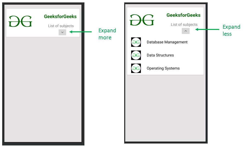
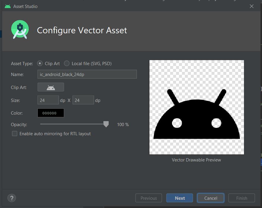
Используемые здесь значки расширения импортируются как векторный ресурс из самой Android Studio. Шаги для этого следующие:
- Щелкните правой кнопкой мыши папку с доступными ресурсами.
- Перейти к новому.
- Щелкните по векторному объекту.
- Появится следующее окно. Щелкните значок рядом с «Картинкой».
- Из множества показанных значков выберите следующие два значка:
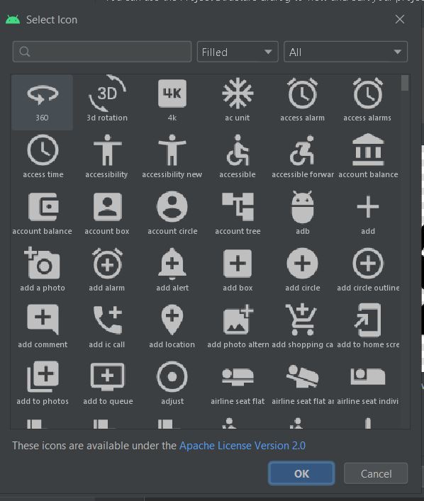
ic_baseline_expand_more_24
ic_baseline_expand_less_24
В папку с возможностью переноса добавляются следующие файлы:
ic_baseline_expand_more_24
android:width="24dp"android:height="24dp"android:viewportWidth="24"android:viewportHeight="24"android:tint="?attr/colorControlNormal"><pathandroid:fillColor="@android:color/white"android:pathData="M16.59, 8.59L12, 13.17 7.41,8.59 6, 10l6, 6 6, -6z"/></vector>ic_baseline_expand_less_24
android:width="24dp"android:height="24dp"android:viewportWidth="24"android:viewportHeight="24"android:tint="?attr/colorControlNormal"><pathandroid:fillColor="@android:color/white"android:pathData="M12, 8l-6, 6 1.41, 1.41L12,10.83l4.59, 4.58L18, 14z"/></vector>
Шаг 4. Измените макет XML
В XML-файле создайте весь макет вместе с частью, которая должна отображаться после раскрытия CardView. Основная идея здесь - установить видимость расширяемого элемента на «пропавший» или «видимый» .
Note: Set the visibility to ‘gone’ and not ‘invisible’ because ‘gone’ removes that particular element completely as if it was never there. However, ‘invisible’ only makes the element disappears while it still exists in the layout.
В приведенном ниже макете CardView развернут, чтобы отобразить список из трех предметов. Ниже приведен код файла activity_main.xml
<? xml version = "1.0" encoding = "utf-8" ?>< androidx.constraintlayout.widget.ConstraintLayout android:layout_width = "match_parent" android:layout_height = "match_parent" android:background = "#E4E3E3" tools:context = ".MainActivity" > <!--Base CardView--> < androidx.cardview.widget.CardView android:id = "@+id/base_cardview" style = "@style/Base.CardView" android:layout_width = "match_parent" android:layout_height = "wrap_content" android:layout_margin = "10dp" app:layout_constraintBottom_toBottomOf = "parent" app:layout_constraintEnd_toEndOf = "parent" app:layout_constraintHorizontal_bias = "0.473" app:layout_constraintStart_toStartOf = "parent" app:layout_constraintTop_toTopOf = "parent" app:layout_constraintVertical_bias = "0.021" > <!--This is a ConstraintLayout for the entire CardView including the expandable portion--> < androidx.constraintlayout.widget.ConstraintLayout android:layout_width = "match_parent" android:layout_height = "wrap_content" app:layout_constraintBottom_toBottomOf = "@+id/base_cardview" app:layout_constraintTop_toTopOf = "parent" app:layout_constraintVertical_bias = "0.511" tools:layout_editor_absoluteX = "-55dp" > <!--This is a ConstraintLayout for the fixed portion of the CardView. The elements that lie within the fixed portion of the CardView can be constrained to this layout.--> < androidx.constraintlayout.widget.ConstraintLayout android:id = "@+id/fixed_layout" android:layout_width = "match_parent" android:layout_height = "150dp" app:layout_constraintBottom_toBottomOf = "parent" app:layout_constraintEnd_toEndOf = "parent" app:layout_constraintHorizontal_bias = "0.0" app:layout_constraintStart_toStartOf = "parent" app:layout_constraintTop_toTopOf = "parent" app:layout_constraintVertical_bias = "0.0" > < ImageView android:id = "@+id/icon" android:layout_width = "150dp" android:layout_height = "150dp" android:src = "@drawable/icon_one" app:layout_constraintBottom_toBottomOf = "@+id/fixed_layout" app:layout_constraintEnd_toEndOf = "@+id/fixed_layout" app:layout_constraintHorizontal_bias = "0.0" app:layout_constraintStart_toStartOf = "@+id/fixed_layout" app:layout_constraintTop_toTopOf = "@+id/fixed_layout" app:layout_constraintVertical_bias = "1.0" /> < TextView android:id = "@+id/heading" android:layout_width = "wrap_content" android:layout_height = "wrap_content" android:text = "GeeksforGeeks" android:textColor = "#006600" android:textSize = "25dp" android:textStyle = "bold" app:layout_constraintBottom_toBottomOf = "@+id/fixed_layout" app:layout_constraintEnd_toEndOf = "@+id/fixed_layout" app:layout_constraintHorizontal_bias = "0.926" app:layout_constraintStart_toStartOf = "@+id/fixed_layout" app:layout_constraintTop_toTopOf = "@+id/fixed_layout" app:layout_constraintVertical_bias = "0.198" /> < TextView android:id = "@+id/list_of_subjects" android:layout_width = "wrap_content" android:layout_height = "wrap_content" android:layout_marginTop = "20dp" android:layout_marginBottom = "58dp" android:text = "List of subjects" android:textSize = "20dp" app:layout_constraintBottom_toBottomOf = "@+id/fixed_layout" app:layout_constraintEnd_toEndOf = "parent" app:layout_constraintHorizontal_bias = "0.878" app:layout_constraintStart_toStartOf = "parent" app:layout_constraintTop_toBottomOf = "@+id/heading" app:layout_constraintVertical_bias = "0.0" /> <!--This is ImageButton for the expansion icon.--> < ImageButton android:id = "@+id/arrow_button" android:layout_width = "wrap_content" android:layout_height = "wrap_content" android:src = "@drawable/ic_baseline_expand_more_24" app:layout_constraintBottom_toBottomOf = "@id/fixed_layout" app:layout_constraintEnd_toEndOf = "parent" app:layout_constraintHorizontal_bias = "0.802" app:layout_constraintStart_toStartOf = "parent" app:layout_constraintTop_toBottomOf = "@+id/list_of_subjects" app:layout_constraintVertical_bias = "0.0" /> </ androidx.constraintlayout.widget.ConstraintLayout > <!--The following is the expandable portion whose visibility is initially set to 'gone'. The parent LinearLayout contains 3 child LinearLayouts that hold a subject name and an icon each.--> < LinearLayout android:id = "@+id/hidden_view" android:layout_width = "match_parent" android:layout_height = "wrap_content" android:orientation = "vertical" android:visibility = "gone" app:layout_constraintBottom_toBottomOf = "parent" app:layout_constraintEnd_toEndOf = "parent" app:layout_constraintStart_toStartOf = "parent" app:layout_constraintTop_toBottomOf = "@+id/fixed_layout" > <!--Child LinearLayout 1--> < LinearLayout android:layout_width = "match_parent" android:layout_height = "match_parent" android:orientation = "horizontal" > < ImageView android:layout_width = "50dp" android:layout_height = "50dp" android:layout_marginStart = "20dp" android:layout_marginTop = "10dp" android:layout_marginEnd = "10dp" android:layout_marginBottom = "10dp" android:src = "@drawable/gfg_icon_black" /> < TextView android:layout_width = "wrap_content" android:layout_height = "wrap_content" android:layout_marginStart = "20dp" android:layout_marginTop = "20dp" android:text = "Database Management" android:textColor = "#000000" android:textSize = "20dp" /> </ LinearLayout > <!--Child LinearLayout 2--> < LinearLayout android:layout_width = "match_parent" android:layout_height = "match_parent" android:orientation = "horizontal" > < ImageView android:layout_width = "50dp" android:layout_height = "50dp" android:layout_marginStart = "20dp" android:layout_marginTop = "10dp" android:layout_marginEnd = "10dp" android:layout_marginBottom = "10dp" android:src = "@drawable/gfg_icon_black" /> < TextView android:layout_width = "wrap_content" android:layout_height = "wrap_content" android:layout_marginStart = "20dp" android:layout_marginTop = "20dp" android:text = "Data Structures" android:textColor = "#000000" android:textSize = "20dp" /> </ LinearLayout > <!--Child LinearLayout 3--> < LinearLayout android:layout_width = "match_parent" android:layout_height = "match_parent" android:orientation = "horizontal" > < ImageView android:layout_width = "50dp" android:layout_height = "50dp" android:layout_marginStart = "20dp" android:layout_marginTop = "10dp" android:layout_marginEnd = "10dp" android:layout_marginBottom = "10dp" android:src = "@drawable/gfg_icon_black" /> < TextView android:layout_width = "wrap_content" android:layout_height = "wrap_content" android:layout_marginStart = "20dp" android:layout_marginTop = "20dp" android:text = "Operating Systems" android:textColor = "#000000" android:textSize = "20dp" /> </ LinearLayout > </ LinearLayout > </ androidx.constraintlayout.widget.ConstraintLayout > </ androidx.cardview.widget.CardView > </ androidx.constraintlayout.widget.ConstraintLayout > |
Шаг 5: измените файл Java
В MainActivity.java с помощью операторов if-else укажите условия для управления видимостью расширяемого элемента.
package com.example.android.expandable_cardview; import android.os.Bundle;import android.transition.AutoTransition;import android.transition.TransitionManager;import android.view.View;import android.widget.ImageButton;import android.widget.LinearLayout;import androidx.appcompat.app.AppCompatActivity;import androidx.cardview.widget.CardView; public class MainActivity extends AppCompatActivity { ImageButton arrow; LinearLayout hiddenView; CardView cardView; @Override protected void onCreate(Bundle savedInstanceState) { super .onCreate(savedInstanceState); setContentView(R.layout.activity_main); cardView = findViewById(R.id.base_cardview); arrow = findViewById(R.id.arrow_button); hiddenView = findViewById(R.id.hidden_view); arrow.setOnClickListener( new View.OnClickListener() { @Override public void onClick(View view) { // If the CardView is already expanded, set its visibility // to gone and change the expand less icon to expand more. if (hiddenView.getVisibility() == View.VISIBLE) { // The transition of the hiddenView is carried out // by the TransitionManager class. // Here we use an object of the AutoTransition // Class to create a default transition. TransitionManager.beginDelayedTransition(cardView, new AutoTransition()); hiddenView.setVisibility(View.GONE); arrow.setImageResource(R.drawable.ic_baseline_expand_more_24); } // If the CardView is not expanded, set its visibility // to visible and change the expand more icon to expand less. else { TransitionManager.beginDelayedTransition(cardView, new AutoTransition()); hiddenView.setVisibility(View.VISIBLE); arrow.setImageResource(R.drawable.ic_baseline_expand_less_24); } } }); }} |