Как использовать mat-icon в angular?
Чтобы включить значки на свою веб-страницу, вы можете использовать директиву mat-icon. Ранее он назывался md-icon. Лучше использовать mat-icon, поскольку они обслуживают значки SVG, то есть векторные значки, которые можно адаптировать к любому разрешению и размеру, с другой стороны, растровые значки имеют фиксированный узор из точек с указанными значениями, а при изменении размера разрешение меняется.
Approach:
First of all we have to load the font library in your HTML file using the following syntax:
<link href=”https://fonts.googleapis.com/icon?family=Material+Icons” rel=”stylesheet”>
Now import MatIconModule in the ngmodule.ts file by using this command:
import {MatIconModule} from "@angular/material/icon";Use the following command to display an icon:
<mat-icon>icon-name</mat-icon>
You can change the color of the icons as per the requirement:
- Primary .
- Accent.
- Warn.
These icon may be used as buttons or may convey some message such as type of form field, status, etc.
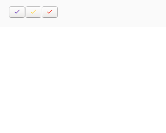
Example:
Using mat-icon let’s create three different buttons.
In your index.html file, load the font library.
<html lang="en"><head> <meta charset="utf-8"> <title>Tutorial</title> <!--font library is loaded prior to using mat-icons--> <link href="https://fonts.googleapis.com/icon?family=Material+Icons&display=block" rel="stylesheet"> </head><body> <app-child></app-child></body></html> |
Now use mat-icon as buttons.
import { Component } from "@angular/core"; @Component({ selector: "app-child", template: ` <button ><mat-icon color = "primary">check</mat-icon></button> <button ><mat-icon color = "accent">check</mat-icon></button> <button ><mat-icon color = "warn">check</mat-icon></button> `, styleUrls: []})export class childComponent { } |
Output: