Группы ввода в Bootstrap с примерами
Группы ввода в Bootstrap используются для расширения элементов управления формы по умолчанию путем добавления текста или кнопок по обе стороны от текстовых вводов, настраиваемых селекторов файлов или настраиваемых вводов.
Основные группы ввода : следующие классы являются базовыми классами, которые используются для добавления групп по обе стороны от полей ввода.
- Класс .input-group-prepend используется для добавления групп в начало ввода.
- Класс .input-group-append используется для добавления его после ввода.
- Класс .input-group-text используется для стилизации текста, отображаемого внутри группы.
В следующем примере демонстрируются эти группы ввода:
<!DOCTYPE html> < html >< head > <!-- Include Bootstrap CSS --> < link rel = "stylesheet" href = " https://maxcdn.bootstrapcdn.com/bootstrap/4.0.0/css/bootstrap.min.css " > < title >Input Groups in Bootstrap</ title ></ head >< body > < div class = "container" > < h3 >Prepend Group Example</ h3 > <!-- Declare an input group --> < div class = "input-group" > <!-- Prepend the following content to the input box --> < div class = "input-group-prepend" > <!-- Define the text content of the group --> < span class = "input-group-text" id = "username" >@</ span > </ div > <!-- Declare an input box --> < input type = "text" class = "form-control" placeholder = "Username" > </ div > < h3 >Append Group Example</ h3 > <!-- Declare an input group --> < div class = "input-group" > <!-- Declare an input group --> < input type = "text" class = "form-control" placeholder = "Email" > <!-- Prepend the following content to the input box --> < div class = "input-group-append" > <!-- Define the text content of the group --> < span class = "input-group-text" id = "email" >@example.com</ span > </ div > </ div > < h3 >Prepend and Append Together</ h3 > <!-- Declare an input group --> < div class = "input-group" > <!-- Prepend the following content to the input box --> < div class = "input-group-prepend" > <!-- Define the text content of the group --> </ div > <!-- Declare an input group --> < input type = "text" class = "form-control" placeholder = "Your domain name here" > <!-- Append the following content to the input box --> < div class = "input-group-append" > <!-- Define the text content of the group --> < span class = "input-group-text" >.com</ span > </ div > </ div > </ div ></ body ></ html > |
Выход: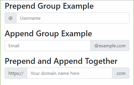
Входные группы могут быть увеличены или уменьшены за счет дополнительных классов. Есть 3 возможных размера входных групп:
- Класс .input-group-sm используется для меньшего размера.
- Класс .input-group-lg используется для большего размера.
- Класс .input-group имеет размер по умолчанию.
Примечание. Определение размеров отдельных элементов входной группы в настоящее время не поддерживается.
Пример:
<!DOCTYPE html> < html >< head > <!-- Include Bootstrap CSS --> < link rel = "stylesheet" href = " https://maxcdn.bootstrapcdn.com/bootstrap/4.0.0/css/bootstrap.min.css " > < title >Input Groups in Bootstrap</ title ></ head >< body > < div class = "container" > < h1 >Sizing</ h1 > <!-- Declare the small input group --> < div class = "input-group input-group-sm mb-3" > <!-- Prepend the following content to the input box --> < div class = "input-group-prepend" > <!-- Define the text content of the group --> < span class = "input-group-text" id = "small" >Small</ span > </ div > <!-- Declare an input box --> < input type = "text" class = "form-control" > </ div > <!-- Declare the normal input group --> < div class = "input-group mb-3" > <!-- Prepend the following content to the input box --> < div class = "input-group-prepend" > <!-- Define the text content of the group --> < span class = "input-group-text" id = "medium" >Default</ span > </ div > <!-- Declare an input box --> < input type = "text" class = "form-control" > </ div > <!-- Declare the large input group --> < div class = "input-group input-group-lg" > <!-- Prepend the following content to the input box --> < div class = "input-group-prepend" > <!-- Define the text content of the group --> < span class = "input-group-text" id = "large" >Large</ span > </ div > <!-- Declare an input box --> < input type = "text" class = "form-control" > </ div > </ div ></ body ></ html > |
Выход: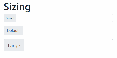
Использование нескольких входов : несколько входов можно использовать с группами входов.
Пример:
<!DOCTYPE html> < html >< head > <!-- Include Bootstrap CSS --> < link rel = "stylesheet" href = " https://maxcdn.bootstrapcdn.com/bootstrap/4.0.0/css/bootstrap.min.css " > < title >Input Groups in Bootstrap</ title ></ head >< body > < div class = "container" > < h3 >Multiple inputs</ h3 > <!-- Declare an input group --> < div class = "input-group" > <!-- Prepend the following content to the input box --> < div class = "input-group-prepend" > <!-- Define the text content of the group --> < span class = "input-group-text" id = "" >First & Last name</ span > </ div > <!-- Declare two input boxes --> < input type = "text" class = "form-control" > < input type = "text" class = "form-control" > </ div > </ div ></ body ></ html > |
Выход: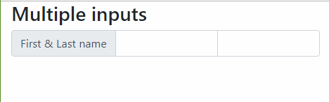
Использование нескольких надстроек : несколько надстроек можно складывать или смешивать вместе с другими типами, включая флажки и переключатели.
Пример:
<!DOCTYPE html> < html >< head > <!-- Include Bootstrap CSS --> < link rel = "stylesheet" href = " https://maxcdn.bootstrapcdn.com/bootstrap/4.0.0/css/bootstrap.min.css " > < title >Input Groups in Bootstrap</ title ></ head >< body > < div class = "container" > < h1 >Multiple addons</ h1 > <!-- Declare an input group --> < div class = "input-group mb-3" > <!-- Prepend the following content to the input box --> < div class = "input-group-prepend" > <!-- Declare two input groups --> < span class = "input-group-text" >$</ span > < span class = "input-group-text" >0.00</ span > </ div > <!-- Declare an input box --> < input type = "text" class = "form-control" > </ div > <!-- Declare an input group --> < div class = "input-group" > <!-- Declare an input box --> < input type = "text" class = "form-control" > <!-- Append the following content to the input box --> < div class = "input-group-append" > <!-- Declare two input texts --> < span class = "input-group-text" >$</ span > < span class = "input-group-text" >0.00</ span > </ div > </ div > </ div ></ body ></ html > |
Выход:
Использование надстроек кнопок: кнопки также могут быть добавлены или добавлены к полю ввода.
Пример:
<!DOCTYPE html> < html >< head > <!-- Include Bootstrap CSS --> < link rel = "stylesheet" href = " https://maxcdn.bootstrapcdn.com/bootstrap/4.0.0/css/bootstrap.min.css " > < title >Input Groups in Bootstrap</ title ></ head >< body > < div class = "container" > < h1 >Button addons</ h1 > <!-- Declare an input group --> < div class = "input-group mb-3" > <!-- Prepend the following content to the input box --> < div class = "input-group-prepend" > <!-- Declare a buttom --> < button class = "btn btn-outline-secondary" type = "button" >Button</ button > </ div > <!-- Declare an input box --> < input type = "text" class = "form-control" > </ div > <!-- Declare an input group --> < div class = "input-group mb-3" > <!-- Declare an input box --> < input type = "text" class = "form-control" > <!-- Append the following content to the input box --> < div class = "input-group-append" > <!-- Declare a buttom --> < button class = "btn btn-outline-secondary" type = "button" >Button</ button > </ div > </ div > <!-- Declare an input group --> < div class = "input-group mb-3" > <!-- Prepend the following content to the input box --> < div class = "input-group-prepend" > <!-- Declare two buttons --> < button class = "btn btn-outline-secondary" type = "button" >Button 1</ button > < button class = "btn btn-outline-secondary" type = "button" >Button 2</ button > </ div > <!-- Declare an input box --> < input type = "text" class = "form-control" > </ div > <!-- Declare an input group --> < div class = "input-group mb-3" > <!-- Declare an input box --> < input type = "text" class = "form-control" > <!-- Append the following content to the input box --> < div class = "input-group-append" > <!-- Declare two buttons --> < button class = "btn btn-outline-secondary" type = "button" >Button 1</ button > < button class = "btn btn-outline-secondary" type = "button" >Button 2</ button > </ div > </ div > </ div ></ body ></ html > |
Выход: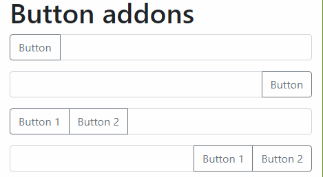
Использование пользовательского выбора : группы ввода могут использоваться с пользовательским выбором.
Примечание. Версии пользовательского выбора по умолчанию для браузера не поддерживаются.
Пример:
<!DOCTYPE html>< html > < head > <!-- Include Bootstrap CSS --> < link rel = "stylesheet" href = " https://maxcdn.bootstrapcdn.com/bootstrap/4.0.0/css/bootstrap.min.css " > < title >Input Groups in Bootstrap</ title ></ head > < body > < div class = "container" > < h3 >Custom select</ h3 > < div class = "input-group mb-3" > < div class = "input-group-prepend" > < label class = "input-group-text" for = "select01" >Options</ label > </ div > < select class = "custom-select" id = "select01" > < option selected>Choose...</ option > < option value = "1" >One</ option > < option value = "2" >Two</ option > < option value
РЕКОМЕНДУЕМЫЕ СТАТЬИ |