Введение в Ant Design и установка для Angular
Ant Design - это шаблон проектирования для продуктов корпоративного уровня, который можно интегрировать с другими интерфейсными фреймворками, такими как Angular, React или Vue. Официальная реализация Ant Design выпущена вместе с React, но ее можно использовать с другими фреймворками JavaScript. Это инструмент с открытым исходным кодом, имеющий около 50,4 тыс. Звезд на GitHub, это вторая по популярности библиотека React UI в мире. Многие компании используют этот шаблон проектирования, например, Alibaba, Tencent, Didi и т. Д.
Особенности Ant Design:
- Поддерживает интернационализацию.
- Богатый и интерактивный пользовательский интерфейс.
- Мощная настройка темы.
- Присутствуют качественные комплектующие.
- Высокая производительность.
Prerequisite:
- A code editor like VSCode, Sublime, Brackets, etc.
- NodeJS should be installed in the system
For Windows
https://www.geeksforgeeks.org/installation-of-node-js-on-windows/
For Linux
https://www.geeksforgeeks.org/installation-of-node-js-on-linux/
- Knowledge of setting up an Angular Project
https://www.geeksforgeeks.org/angular-7-installation/
Installation of Ant Design of Angular
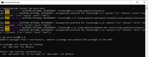
- In the terminal, go to that folder of the angular project which you have created, then install Ant Design of Angular by using the following command:
npm install ng-zorro-antd
- In “angular.json” file add Ant Design .css file in styles array as given below:
{"$schema":"./node_modules/@angular/cli/lib/config/schema.json","version": 1,"newProjectRoot":"projects","projects": {"myAntApp": {"projectType":"application","schematics": {"@schematics/angular:component": {"style":"scss"}},"root":"","sourceRoot":"src","prefix":"app","architect": {"build": {"builder":"@angular-devkit/build-angular:browser","options": {"outputPath":"dist/myAntApp","index":"src/index.html","main":"src/main.ts","polyfills":"src/polyfills.ts","tsConfig":"tsconfig.app.json","aot":true,"assets": ["src/favicon.ico","src/assets"],"styles": ["node_modules/ng-zorro-antd/src/ng-zorro-antd.min.css","src/styles.scss"],"scripts": []},"configurations": {"production": {"fileReplacements": [{"replace":"src/environments/environment.ts","with":"src/environments/environment.prod.ts"}],"optimization":true,"outputHashing":"all","sourceMap":false,"extractCss":true,"namedChunks":false,"extractLicenses":true,"vendorChunk":false,"buildOptimizer":true,"budgets": [{"type":"initial","maximumWarning":"2mb","maximumError":"5mb"},{"type":"anyComponentStyle","maximumWarning":"6kb","maximumError":"10kb"}]}}},"serve": {"builder":"@angular-devkit/build-angular:dev-server","options": {"browserTarget":"myAntApp:build"},"configurations": {"production": {"browserTarget":"myAntApp:build:production"}}},"extract-i18n": {"builder":"@angular-devkit/build-angular:extract-i18n","options": {"browserTarget":"myAntApp:build"}},"test": {"builder":"@angular-devkit/build-angular:karma","options": {"main":"src/test.ts","polyfills":"src/polyfills.ts","tsConfig":"tsconfig.spec.json","karmaConfig":"karma.conf.js","assets": ["src/favicon.ico","src/assets"],"styles": ["src/styles.scss"],"scripts": []}},"lint": {"builder":"@angular-devkit/build-angular:tslint","options": {"tsConfig": ["tsconfig.app.json","tsconfig.spec.json","e2e/tsconfig.json"],"exclude": ["**/node_modules/**"]}},"e2e": {"builder":"@angular-devkit/build-angular:protractor","options": {"protractorConfig":"e2e/protractor.conf.js","devServerTarget":"myAntApp:serve"},"configurations": {"production": {"devServerTarget":"myAntApp:serve:production"}}}}}},"defaultProject":"myAntApp"} - In “app.module.ts” import the Ant Design button module, so that we can access it in .html file as given below:
import { BrowserModule } from"@angular/platform-browser";import { NgModule } from"@angular/core";import { AppRoutingModule } from"./app-routing.module";import { AppComponent } from"./app.component";import { NzButtonModule } from"ng-zorro-antd/button";@NgModule({declarations: [AppComponent],imports: [BrowserModule,AppRoutingModule,NzButtonModule],providers: [],bootstrap: [AppComponent]})export class AppModule { } - In “app.component.html” file add the following code as given below:
<buttonnz-buttonnzType="primary">Primary</button><buttonnz-buttonnzType="default">Default</button><buttonnz-buttonnzType="dashed">Dashed</button> - Add some CSS in “app.component.scss” to show the buttons at the center as given below:
[nz-button] {margin-left: 50%;margin-top: 3%;}- In the terminal, run the application in the browser by using the following command:
ng serve -o
Output:
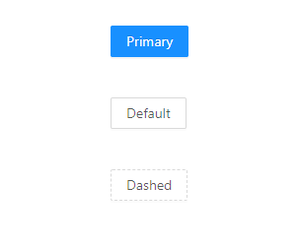
Final Output in the browser
- In the terminal, run the application in the browser by using the following command: