Постройте горизонтальную линию в Matplotlib
Matplotlib - популярная библиотека Python, используемая для построения графиков. Она предоставляет объектно-ориентированный API для визуализации графиков графического интерфейса.
Построить горизонтальную линию довольно просто, используя axhline ()
The axhline() function in pyplot module of matplotlib library is used to add a horizontal line across the axis.
Syntax: matplotlib.pyplot.axhline(y, color, xmin, xmax, linestyle)
Parameters:
- y: Position on Y axis to plot the line, It accepts integers.
- xmin and xmax: scalar, optional, default: 0/1. It plots the line in the given range
- color: color for the line, It accepts a string. eg ‘r’ or ‘b’ .
- linestyle: Specifies the type of line, It accepts a string. eg ‘-‘, ‘–‘, ‘-.’, ‘:’, ‘None’, ‘ ‘, ”, ‘solid’, ‘dashed’, ‘dashdot’, ‘dotted’
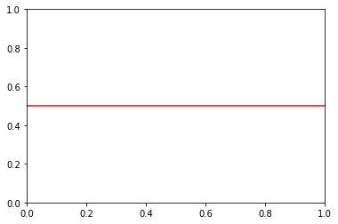
Plotting a single horizontal line
Python3
# importing libraryimport matplotlib.pyplot as plt # specifying horizontal line typeplt.axhline(y = 0.5, color = "r", linestyle = "-") # rendering the plotplt.show() |
Выход:
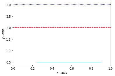
Построение нескольких горизонтальных линий
To plot multiple horizontal lines, use the axhline() method multiple times.
Python
# importing the moduleimport matplotlib.pyplot as plt # plotting line within the given rangeplt.axhline(y = .5, xmin = 0.25, xmax = 0.9) # line colour is blueplt.axhline(y = 3, color = "b", linestyle = ":") # line colour is whiteplt.axhline(y = 1, color = "w", linestyle = "--") # line colour is redplt.axhline(y = 2, color = "r", linestyle = "dashed") # adding axis labels plt.xlabel("x - axis")plt.ylabel("y - axis") # displaying the plotplt.show() |
Выход:
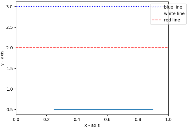
Добавление легенды
The legend can be added using the legend() function.
Python3
# importing the moduleimport matplotlib.pyplot as plt # plotting line within the given rangeplt.axhline(y = .5, xmin = 0.25, xmax = 0.9) # line colour is blueplt.axhline(y = 3, color = "b", linestyle = ":", label = "blue line") # line colour is whiteplt.axhline(y = 1, color = "w", linestyle = "--", label = "white line") # line colour is redplt.axhline(y = 2, color = "r", linestyle = "dashed", label = "red line") # adding axis labels plt.xlabel("x - axis")plt.ylabel("y - axis") # plotting the legendplt.legend(bbox_to_anchor = (1.0, 1), loc = "upper center") # displaying the plotplt.show() |
Выход:
Внимание компьютерщик! Укрепите свои основы с помощью базового курса программирования Python и изучите основы.
Для начала подготовьтесь к собеседованию. Расширьте свои концепции структур данных с помощью курса Python DS. А чтобы начать свое путешествие по машинному обучению, присоединяйтесь к курсу Машинное обучение - базовый уровень.