Matplotlib.pyplot.ylabel () в Python
Matplotlib - очень мощная библиотека для построения графиков, полезная для тех, кто работает с Python и NumPy. А для статистического вмешательства становится очень необходимо визуализировать наши данные, и Matplotlib - инструмент, который может быть очень полезным для этой цели.
matplotlib.pyplot.ylabel ()
Эта функция устанавливает метку для оси Y графика.
Syntax: matplotlib.pyplot.ylabel(ylabel, fontdict=None, labelpad=None)
Parameters:
ylabel: The name of the label
fontdict: Adds the font styles to the label
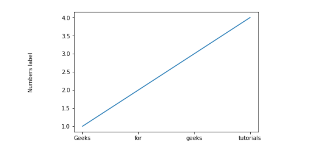
labelpad: This helps us to set the spacing between label and the axis
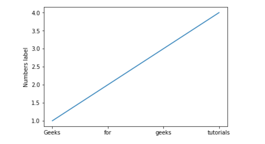
Пример №1:
import matplotlib.pyplot as plt # setting x valuesx =["Geeks", "for", "geeks", "tutorials"] # Setting y values y =[1, 2, 3, 4] # Adding label on the y-axisplt.ylabel("Numbers label") # plotting the graphplt.plot(x, y) |
Output:
Example #2:
import matplotlib.pyplot as plt x =["Geeks", "for", "geeks", "tutorials"]y =[1, 2, 3, 4] # Adding space between label and# axis by setting labelpadplt.ylabel("Numbers label", labelpad = 50) plt.plot(x, y) |
Output:
Example #3:
import matplotlib.pyplot as plt x =["Geeks", "for", "geeks", "tutorials"]y =[1, 2, 3, 4] # Setting font dictionary font = {"family": "Verdana", "color": "green", "size": 20, } # Adding the font styles to the labelplt.ylabel("Numbers label", fontdict = font) plt.plot(x, y) |
Output: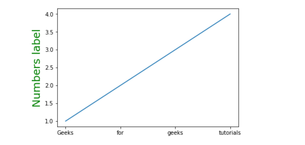
Attention geek! Strengthen your foundations with the Python Programming Foundation Course and learn the basics.
To begin with, your interview preparations Enhance your Data Structures concepts with the Python DS Course. And to begin with your Machine Learning Journey, join the Machine Learning – Basic Level Course