matplotlib.pyplot.axhline () в Python
Matplotlib - это библиотека на Python, которая является численно-математическим расширением библиотеки NumPy. Pyplot - это интерфейс на основе состояний для модуля Matplotlib, который предоставляет интерфейс, подобный MATLAB.
Функция matplotlib.pyplot.axhline ()
Функция axhline () в модуле pyplot библиотеки matplotlib используется для добавления горизонтальной линии поперек оси.
Syntax: matplotlib.pyplot.axhline(y=0, xmin=0, xmax=1, **kwargs)
Parameters: This method accept the following parameters that are described below:
- y: This parameter is an optional and it is position in data coordinates of the horizontal line.
- xmin: This parameter is a scalar and optional. Its default value is 0.
- xmax: This parameter is a scalar and optional. Its default value is 1.
Returns: This returns the following:
line : This returns the line created by this function.
Примеры ниже иллюстрируют функцию matplotlib.pyplot.axhline () в matplotlib.pyplot:
Example #1:
# Implementation of matplotlib.pyplot.annotate() function import numpy as npimport matplotlib.pyplot as plt t = np.linspace(-10, 10, 100)sig = 1 / t plt.axhline(y = 0, color ="green", linestyle ="--")plt.axhline(y = 0.5, color ="green", linestyle =":")plt.axhline(y = 1.0, color ="green", linestyle ="--") plt.axvline(color ="black") plt.plot(t, sig, linewidth = 2, label = r"$sigma(t) = frac{1}{x}$") plt.xlim(-10, 10)plt.xlabel("t")plt.title("Graph of 1 / x")plt.legend(fontsize = 14) plt.show() |
Выход: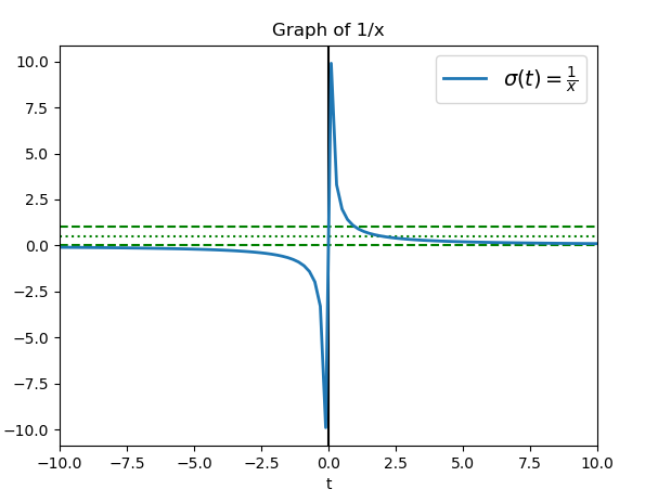
Example #2:
# Implementation of matplotlib.pyplot.annotate() # function import numpy as npimport matplotlib.pyplot as plt x = np.linspace(0, 13, 100) plt.rcParams["lines.linewidth"] = 2plt.figure() plt.plot(x, np.sin(x), label ="Line1", color ="green", linestyle ="--") plt.plot(x, np.sin(x + 0.5), label ="Line2", color ="black", linestyle =":") plt.axhline(0, label ="Line3", color ="black") plt.title("Axhline() Example")l = plt.legend(loc ="upper right") # legend between blue and orange # linel.set_zorder(2.5) plt.show() |
Выход: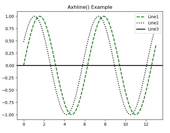
Внимание компьютерщик! Укрепите свои основы с помощью базового курса программирования Python и изучите основы.
Для начала подготовьтесь к собеседованию. Расширьте свои концепции структур данных с помощью курса Python DS. А чтобы начать свое путешествие по машинному обучению, присоединяйтесь к курсу Машинное обучение - базовый уровень.