Как создать панель загрузки анимации с помощью CSS?
Панель загрузки с анимацией может быть создана с использованием HTML и CSS.

Мы создадим загрузчик, который является частью операционной системы, отвечающей за загрузку программ и библиотек. Индикатор выполнения - это графический элемент управления, используемый для визуализации процесса расширенной компьютерной операции, поэтому здесь мы используем индикатор выполнения в качестве анимации в загрузчике. Мы создадим панель загрузки, используя свойства HTML и CSS.
HTML Code: In this section, we will design the basic structure of the HTML code.
<!DOCTYPE html><html lang="en"> <head> <meta charset="UTF-8"> <meta name="viewport" content= "width=device-width, initial-scale=1.0"> <title>Loader Bar</title> <link rel="stylesheet" href="style.css"></head> <body> <div class="loader"> <div class="loading_1"></div> <div class="loading_2">Loading GfG...</div> </div></body> </html> |
Код CSS: в этом разделе мы будем использовать некоторые свойства CSS для разработки панели загрузки . Мы будем использовать @keyframes, который указывает код анимации. Анимация создается путем постепенного перехода от одного набора стилей CSS к другому. Изменения стилей происходят в процентах с использованием ключевых слов «от» (0%) и «до» (100%). Мы можем менять набор стилей CSS много раз.
<style> body { background-color: #262626; font-family: Lato, sans-serif; } .loader { width: 150px; margin: 150px auto 70px; position: relative; } .loader .loading_1 { position: relative; width: 100%; height: 10px; border: 1px solid yellowgreen; border-radius: 10px; animation: turn 4s linear 1.75s infinite; } .loader .loading_1:before { content: ""; display: block; position: absolute; width: 0; height: 100%; background-color: yellowgreen; box-shadow: 10px 0px 15px 0px yellowgreen; animation: load 2s linear infinite; } .loader .loading_2 { position: absolute; width: 100%; top: 10px; color: green; font-size: 22px; text-align: center; animation: bounce 2s linear infinite; } @keyframes load { 0% { width: 0%; } 87.5% { width: 100%; } } @keyframes turn { 0% { transform: rotateY(0deg); } 6.25%, 50% { transform: rotateY(180deg); } 56.25%, 100% { transform: rotateY(360deg); } } @keyframes bounce { 0%, 100% { top: 10px; } 12.5% { top: 30px; } }</style> |
Complete Code: It is the combination of above two code section of HTML and CSS. In the following code, we have added the CSS code internally in the HTML code.
<!DOCTYPE html><html lang="en"> <head> <meta charset="UTF-8"> <meta name="viewport" content= "width=device-width, initial-scale=1.0"> <title>Loader Bar</title> <style> body { background-color: #262626; font-family: Lato, sans-serif; } .loader { width: 150px; margin: 150px auto 70px; position: relative; } .loader .loading_1 { position: relative; width: 100%; height: 10px; border: 1px solid yellowgreen; border-radius: 10px; animation: turn 4s linear 1.75s infinite; } .loader .loading_1:before { content: ""; display: block; position: absolute; width: 0; height: 100%; background-color: yellowgreen; box-shadow: 10px 0px 15px 0px yellowgreen; animation: load 2s linear infinite; } .loader .loading_2 { position: absolute; width: 100%; top: 10px; color: green; font-size: 22px; text-align: center; animation: bounce 2s linear infinite; } @keyframes load { 0% { width: 0%; } 87.5% { width: 100%; } } @keyframes turn { 0% { transform: rotateY(0deg); } 6.25%, 50% { transform: rotateY(180deg); } 56.25%, 100% { transform: rotateY(360deg); } } @keyframes bounce { 0%, 100% { top: 10px; } 12.5% { top: 30px; } } </style></head> <body> <div class="loader"> <div class="loading_1"></div> <div class="loading_2">Loading GfG...</div> </div></body> </html> |
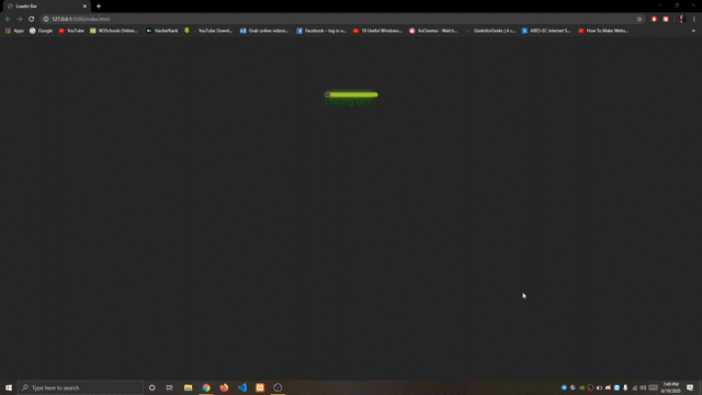
Вывод: На следующем изображении показана панель загрузки с анимацией.