Как создать наклонные линии с помощью CSS?
Опубликовано: 1 Марта, 2022
Предпосылка - CSS
These sloping lines are easily implemented using background-image property in CSS,
Normal Colored Diagonal Stripes: Here, the diagonal stripes constructed using repeating-linear-gradient() in CSS.
Example:
<!DOCTYPE html><html><head><metacharset="utf-8"><style>.module {background: white;border: 1px solid #ccc;margin: 3%;width: 40%;> h2 {padding: 1rem;margin: 0 0 0.5rem 0;}}.stripe-1 {color: white;background: repeating-linear-gradient(/*Angle of sloping line*/45deg,/*First Color of the Stripe*/#fff,#fff 10px,/*Second Color of the Stripe*/#aed581 10px,#aed581 20px);}</style></head><body><divclass="module"><h2class="stripe-1">GFG</h2></div></body></html>Output:
Gradient Diagonal Stripes: This makes half the stripes totally transparent using repeating-linear-gradient(), it can appear as if the stripes have gradients.
Example:
<!DOCTYPE html><html><head><metacharset="utf-8"><style>.module {background: white;border: 1px solid #ccc;margin: 3%;width: 40%;> h2 {padding: 1rem;margin: 0 0 0.5rem 0;}}.stripe-1 {color: white;background: repeating-linear-gradient(/*Angle of the slope line*/45deg,/*To make The stripe transparent at the end*/transparent,transparent 10px,#ccc 10px,#ccc 20px),linear-gradient(to bottom,/*Color of the Stripe*/green,green);}</style></head><body><divclass="module"><h2class="stripe-1">GFG</h2></div></body></html>Output:
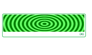
Radial Stripes: These stripes are implemented using radial gradients can be use under repeating-linear-gradients().
Example:
<!DOCTYPE html><html><head><metacharset="utf-8"><style>.module {background: white;border: 1px solid #ccc;margin: 3%;width: 40%;> h2 {padding: 1rem;margin: 0 0 0.5rem 0;}}.stripe-1 {color: white;background: repeating-radial-gradient(/*Shape of the repeating lines*/circle,/*First Color of the stripe*/green,green 10px,/*Second Color of the stripe*/#aed581 10px,#aed581 20px);}</style></head><body><divclass="module"><h2class="stripe-1">GFG</h2></div></body></html>Output: