Как создать круговой индикатор ProgressBar в Android?
В этой статье мы собираемся продемонстрировать, как создать круговой индикатор выполнения в Android Studio, который отображает текущее значение прогресса и изначально имеет серый цвет фона. Здесь прогресс отображается в центре панели . Образец GIF приведен ниже, чтобы получить представление о том, что мы собираемся делать в этой статье. Обратите внимание, что мы собираемся реализовать этот проект на языке Java .
Пошаговая реализация
Шаг 1: Создайте новый проект
Чтобы создать новый проект в Android Studio, обратитесь к разделу «Как создать/запустить новый проект в Android Studio». Обратите внимание, что вы должны выбрать Java в качестве языка программирования.
Шаг 2: Создайте новый файл ресурсов Drawable
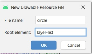
Создайте новый файл ресурсов Drawable с именем circle.xml в папке drawable. Чтобы создать новый файл ресурсов Drawable , перейдите к res > drawable и следуйте изображениям.
приведен ниже:
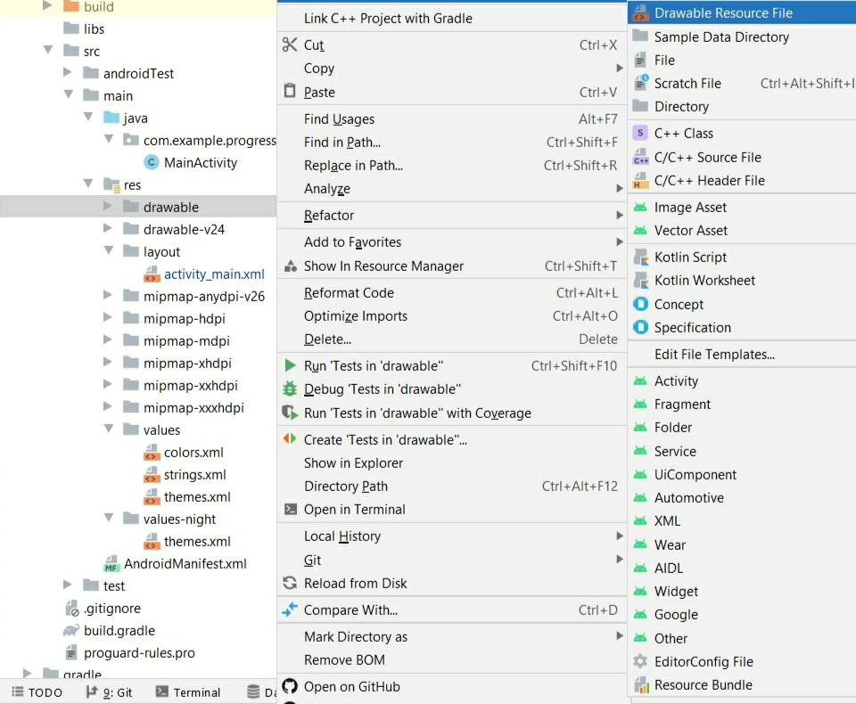
Щелкните Drawable Resource File, откроется новое диалоговое окно, как показано на изображении ниже. Добавьте имя файла и выберите корневой элемент в качестве списка слоев и нажмите OK .
Шаг 3: Работа с файлом circle.xml
Перейдите к res > drawable > circle.xml и добавьте в этот файл приведенный ниже код. В этом файле мы будем рисовать круг, показывающий прогресс. В код добавлены комментарии для лучшего понимания.
XML
<?xml version="1.0" encoding="utf-8"?> <!--Adding our first item--> <item> <!--Here ring shape is created. The important attribute used here is, android:useLevel="false". Attribute with the useLevel=true makes the ring disabled, so it must be false for the ring to appear with color code "#DDD"--> <shape android:shape="ring" android:thicknessRatio="16" android:useLevel="false"> <solid android:color="#DDD" /> </shape> </item> <!--Adding our second item--> <item> <!--Rotation degree of Ring is made from 270 to 270--> <rotate android:fromDegrees="270" android:toDegrees="270"> <!--The main attribute used here is android:useLevel="true" in shape tag. Also gradient is added to set the startColor and endColor of the ring.--> <shape android:shape="ring" android:thicknessRatio="16" android:useLevel="true"> <gradient android:endColor="@color/teal_700" android:startColor="@color/black" android:type="sweep" /> </shape> </rotate> </item></layer-list> |
Шаг 4: Добавление стиля в ProgressBar
Перейдите к res > layout > theme.xml и добавьте в этот файл приведенный ниже код. Мы добавили новый стиль в этот файл. Комментарии были добавлены должным образом для ясного понимания.
XML
<!-- Base application theme. --> <style name="Theme.ProgressBar" parent="Theme.MaterialComponents.DayNight.DarkActionBar"> <!-- Primary brand color. --> <item name="colorPrimary">@color/green</item> <item name="colorPrimaryVariant">@color/green</item> <item name="colorOnPrimary">@color/white</item> <!-- Secondary brand color. --> <item name="colorSecondary">@color/teal_200</item> <item name="colorSecondaryVariant">@color/teal_700</item> <item name="colorOnSecondary">@color/black</item> <!-- Status bar color. --> <item name="android:statusBarColor" tools:targetApi="l">?attr/colorPrimaryVariant</item> <!-- Customize your theme here. --> </style> <!--Here, android: indeterminateDrawable sets the picture displayed in the animation or the xml file of this animation and android: indeterminateOnly This property is set to true,the progress bar will be ignored Progress and present an infinite loop of animation --> <style name="CircularDeterminateProgressBar"> <item name="android:indeterminateOnly">false </item> <item name="android:progressDrawable">@drawable/circle</item> </style></resources> |
Шаг 5: Работа с файлом activity_main.xml
Перейдите в раздел res > layout > activity_main.xml и добавьте в этот файл приведенный ниже код. Здесь мы добавили ProgressBar , который показывает прогресс, и добавлен TextView для отображения процента прогресса. Также были добавлены две кнопки для увеличения или уменьшения прогресса. В код добавлены необходимые комментарии.
XML
<?xml version="1.0" encoding="utf-8"?><androidx.constraintlayout.widget.ConstraintLayout android:layout_width="match_parent" android:layout_height="match_parent" tools:context=".MainActivity"> <!--Add ProgressBar. Main Attribute used here are style="@style/CircularDeterminateProgressBar" that takes style as created in theme.xml file above and android:progressDrawable="@drawable/circle" that has been created in circle.xml file above.--> <ProgressBar android:id="@+id/progress_bar" style="@style/CircularDeterminateProgressBar" android:layout_width="200dp" android:layout_height="200dp" android:indeterminateOnly="false" android:progress="60" android:progressDrawable="@drawable/circle" android:rotation="-90" app:layout_constraintBottom_toBottomOf="parent" app:layout_constraintLeft_toLeftOf="parent" app:layout_constraintRight_toRightOf="parent" app:layout_constraintTop_toTopOf="parent" tools:progress="60" /> <TextView android:id="@+id/text_view_progress" android:layout_width="wrap_content" android:layout_height="wrap_content" android:textAppearance="@style/TextAppearance.AppCompat.Large" app:layout_constraintBottom_toBottomOf="@+id/progress_bar" app:layout_constraintEnd_toEndOf="@+id/progress_bar" app:layout_constraintStart_toStartOf="@+id/progress_bar" app:layout_constraintTop_toTopOf="@+id/progress_bar" tools:text="60%" /> <!--Increment button that will decrement the progress by 10%--> <Button android:id="@+id/button_decr" android:layout_width="wrap_content" android:layout_height="wrap_content" android:text="- 10%" app:layout_constraintStart_toStartOf="@+id/progress_bar" app:layout_constraintTop_toBottomOf="@+id/progress_bar" /> <!--Increment button that will increment the progress by 10%--> <Button android:id="@+id/button_incr" android:layout_width="wrap_content" android:layout_height="wrap_content" android:text="+ 10%" app:layout_constraintEnd_toEndOf="@+id/progress_bar" app:layout_constraintTop_toBottomOf="@+id/progress_bar" /> </androidx.constraintlayout.widget.ConstraintLayout> |
Шаг 6: Работа с файлом MainActivity.java
Перейдите к файлу MainActivity.java и добавьте в этот файл приведенный ниже код. Здесь реализовано свойство ProgressBar. В код добавлены комментарии для быстрого и ясного понимания.
Java
import android.os.Bundle;import android.view.View;import android.widget.Button;import android.widget.ProgressBar;import android.widget.TextView;import androidx.appcompat.app.AppCompatActivity;public class MainActivity extends AppCompatActivity { private int progress = 0; Button buttonIncrement; Button buttonDecrement; ProgressBar progressBar; TextView textView; @Override protected void onCreate(Bundle savedInstanceState) { super.onCreate(savedInstanceState); setContentView(R.layout.activity_main); buttonDecrement = (Button) findViewById(R.id.button_decr); buttonIncrement = (Button) findViewById(R.id.button_incr); progressBar = (ProgressBar) findViewById(R.id.progress_bar); textView = (TextView) findViewById(R.id.text_view_progress); // when clicked on buttonIncrement progress in increased by 10% buttonIncrement.setOnClickListener(new View.OnClickListener() { @Override public void onClick(View v) { // if progress is less than or equal // to 90% then only it can be increased if (progress <= 90) { progress += 10; updateProgressBar(); } } }); // when clicked on buttonIncrement progress in decreased by 10% buttonDecrement.setOnClickListener(new View.OnClickListener() { @Override public void onClick(View v) { // If progress is greater than // 10% then only it can be decreased if (progress >= 10) { progress -= 10; updateProgressBar(); } } }); } // updateProgressBar() method sets // the progress of ProgressBar in text private void updateProgressBar() { progressBar.setProgress(progress); textView.setText(String.valueOf(progress)); }} |
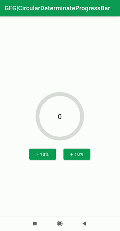
Выход: