Как использовать SASS для создания нового набора цветовых стилей в Bootstrap 4?
По умолчанию Bootstrap 4 предоставляет все стили цветов, которые доступны как переменные SASS и карту SASS в файле scss / _variables.scss . В следующем выпуске будет предоставлен ультра-новый оттенок, например палитра оттенков серого. В карте SASS определено множество цветовых серий, которые зацикливаются для генерации настраиваемых наборов правил. Цвета Bootstrap 4 включают как цвета темы, так и цвета компонентов для этой карты SASS, играющей жизненно важную роль.
Инициализация цветовых переменных с использованием SASS:
- Пример карты SASS: файл _colors.scss
"white": $white,$hotpink:hotpink;$lightsalmon:#fa9872;$lightgreen:#76FF03;$palegreen:#00E676;$gray-900:#212121;$colors: ("white": $white,"hotpink": $hotpink,"palegreen":$palegreen,"lightgreen":$lightgreen,"lightsalmon":$lightsalmon,"gray-dark": $gray-900) !default;
Подход 1. Здесь мы обрабатываем цвета кнопок для создания карты цветов SASS $ после создания карты цветов SASS $, импортируем ее с помощью @import и создаем @mixin в том же файле. В общем, класс SASS для цветов кнопок в основном основан на «btn-variant» и btn-ouline-variant. Здесь вариант - это утилиты цвета, такие как первичный, вторичный и т. Д. Сгенерируйте @mixin для этих btn-variant и btn-outline-variant. Затем используйте @include, чтобы включить созданный выше @mixin в соответствующий класс файла SASS следующим образом.
- Файл SASS: gfg.scss
/* Importing colors map */@import'./colors';/* Generating @mixin based on 'btn-variant' */@mixin btn-variant ($color1, $color2,$color-hover: color-yiq($color1)) {background-color: $color1;border-color: $color1;color:$color2;}/* Generating @mixin based on 'btn-outline-variant' */@mixin btn-outline-variant($color1, $color2) {background-color: $color2;border-color: $color1;color:$color1;}/* Including @mixin based on 'btn-variant' andhover properties within a custom class*/.btn-hotpink {@include btn-variant($hotpink,white, $hotpink);&:hover {background-color: $hotpink!important;color: $white!important;}}.btn-lightgreen {@include btn-variant($lightgreen,white, $lightgreen);&:hover {background-color: $lightgreen!important;color: $white!important;}}.btn-lightsalmon {@include btn-variant($lightsalmon,white, $lightsalmon);&:hover {background-color: $lightsalmon!important;color: $white!important;}}/* Including @mixin based on 'btn-outline-variant'and hover properties within a custom class */.btn-outline-hotpink {@include btn-outline-variant($hotpink,white);&:hover {background-color: $hotpink!important;color: $white!important;}}.btn-outline-lightgreen {@include btn-outline-variant($lightgreen,white);&:hover {background-color: $lightgreen!important;color: $white!important;}}.btn-outline-lightsalmon {@include btn-outline-variant($lightsalmon,white);&:hover {background-color: $lightsalmon!important;color: $white!important;}} - Скомпилированный файл CSS: gfg.css
.btn-hotpink {background-color: hotpink;border-color: hotpink;color:white;}.btn-hotpink:hover {background-color: hotpink!important;color:#FFFFFF!important;}.btn-outline-hotpink {background-color:white;border-color: hotpink;color: hotpink;}.btn-outline-hotpink:hover {background-color: hotpink!important;color:#FFFFFF!important;}.btn-lightgreen {background-color:#76FF03;border-color:#76FF03;color:white;}.btn-lightgreen:hover {background-color:#76FF03!important;color:#FFFFFF!important;}.btn-outline-lightgreen {background-color:white;border-color:#76FF03;color:#76FF03;}.btn-outline-lightgreen:hover {background-color:#76FF03!important;color:#FFFFFF!important;}.btn-lightsalmon {background-color:#fa9872;border-color:#fa9872;color:white;}.btn-lightsalmon:hover {background-color:#fa9872!important;color:#FFFFFF!important;}.btn-outline-lightsalmon {background-color:white;border-color:#fa9872;color:#fa9872;}.btn-outline-lightsalmon:hover {background-color:#fa9872!important;color:#FFFFFF!important;}/* sourceMappingURL=bs4buttonsex01.css.map */ - HTML-файл: index.html
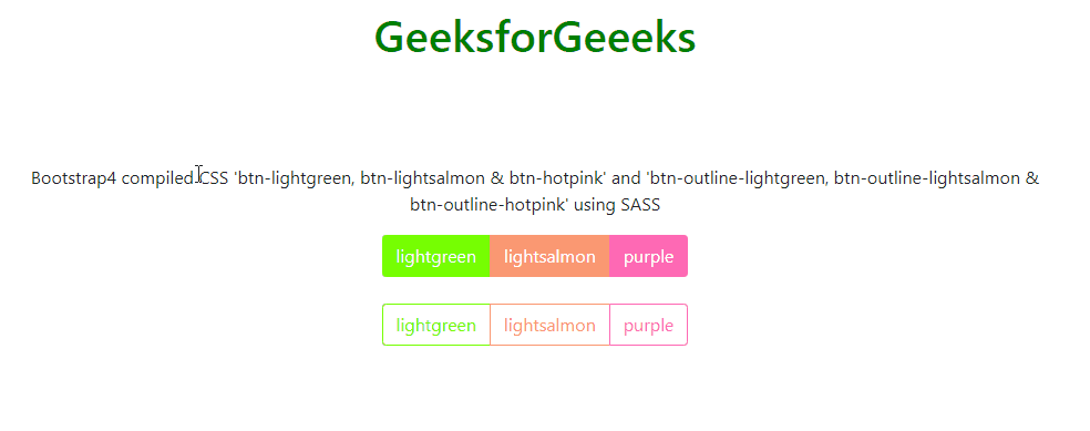
<!DOCTYPE html><htmllang="en"><head><metacharset="utf-8"><metaname="viewport"content="width=device-width, initial-scale=1"><linkrel="stylesheet"href=<linkrel="stylesheet"href="./gfg.css"><scriptsrc=</script><scriptsrc=</script><scriptsrc=</script></head><body><divclass="container"><center><h1style="color:green;padding:13px;">GeeksforGeeeks</h1><br><br><p>Bootstrap4 compiled CSS 'btn-lightgreen,btn-lightsalmon & btn-hotpink' and'btn-outline-lightgreen,btn-outline-lightsalmon &btn-outline-hotpink' using SASS</p><divclass="btn-group"><buttontype="button"class="btn btn-lightgreen">lightgreen</button><buttontype="button"class="btn btn-lightsalmon">lightsalmon</button><buttontype="button"class="btn btn-hotpink">purple</button></div><br><br><divclass="btn-group"><buttontype="button"class="btn btn-outline-lightgreen">lightgreen</button><buttontype="button"class="btn btn-outline-lightsalmon">lightsalmon</button><buttontype="button"class="btn btn-outline-hotpink">purple</button></div></center></div></body></html> - Выход:
Подход 2. Обработка цветов фона и текста. После создания карты цветов SASS $ импортируйте ее с помощью @import и создайте @mixin в том же файле. В общем, класс SASS для цветов кнопок в основном основан на «bg-variant» и text-variant. Здесь вариант - это утилиты цвета, такие как первичный, вторичный и т. Д. Сгенерируйте @mixin для этих вариантов bg и текста. Затем используйте @include, чтобы включить созданный выше @mixin в соответствующий класс файла SASS следующим образом:
- Файл SASS: geeks.scss
@import'./colors';@mixin bg-variant ($color1, $color2) {background-color: $color1;color: $color2;}@mixin text-variant($color1) {color: $color1;}.bg-palegreen {@include bg-variant($palegreen,white);}.text-palegreen {@include text-variant($palegreen);}.bg-gray900{@include bg-variant($gray-900,white);}.text-gray900{@include text-variant($gray-900);} - Скомпилированный файл CSS: geeks.css
.bg-palegreen {background-color:#00E676;color:white;}.text-palegreen {color:#00E676;}.bg-gray900{background-color:#212121;color:white;}.text-gray900{color:#212121;}/*# sourceMappingURL=bs4buttonsex02.css.map *//*# sourceMappingURL=bs4buttonsex02.css.map */ - HTML-файл: index2.html
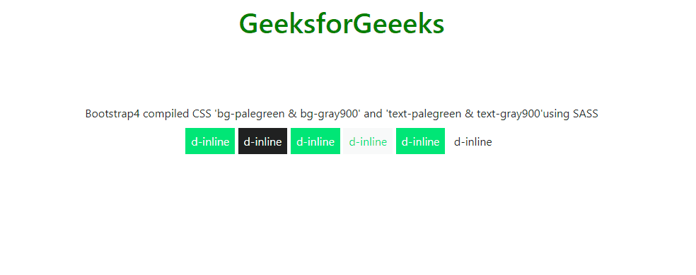
<!DOCTYPE html><htmllang="en"><head><metacharset="utf-8"><metaname="viewport"content="width=device-width, initial-scale=1"><linkrel="stylesheet"href=<linkrel="stylesheet"href="./geeks.css"><scriptsrc=</script><scriptsrc=</script><scriptsrc=</script></head><body><divclass="container"><center><h1style="color:green;padding:13px;">GeeksforGeeeks</h1><br><br><p>Bootstrap4 compiled CSS 'bg-palegreen &bg-gray900' and 'text-palegreen &text-gray900'using SASS</p><divclass="d-inline p-2 bg-palegreen text-white">d-inline</div><divclass="d-inline p-2 bg-gray900 text-white">d-inline</div><divclass="d-inline p-2 bg-palegreen text-white">d-inline</div><divclass="d-inline p-2 bg-light text-palegreen">d-inline</div><divclass="d-inline p-2 bg-palegreen text-white">d-inline</div><divclass="d-inline p-2 bg-white text-gray900">d-inline</div></center></div></body></html> - Выход:
Ссылка: https://getbootstrap.com/docs/4.4/getting-started/theming/#color